


Tropicana’s 2009 packaging redesign failure is in my eyes one of the most interesting case studies about branding through packaging design.
At The Branding Journal, we enjoy featuring branding success stories. However analyzing branding failures can sometimes be even more interesting, as it allows us to learn from past mistakes.
Announcement: Our practical course 'How to Build a Successful Brand' is launching soon. Join the Priority List now for a $150 Discount and be notified when we go live!
Table of Contents
Introduction
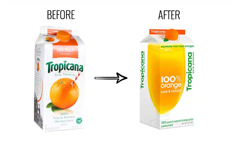
The famous fruit juice brand Tropicana, owned by PepsiCo, made a major misstep in 2009. On January 9th of that year, Tropicana decided to replace the existing packaging for its best-selling orange juice with a new design for the North American market.
However, this move backfired quickly. The majority of loyal Tropicana customers rejected and criticized the new look. The backlash was so severe that Tropicana had to revert back to the original design, the iconic orange juice packaging that consumers knew and loved.
The attempted rebranding was a failure of epic proportions, showing the risks of altering a well-known product visual identity that resonates with customers. Tropicana learned the hard way not to fix what isn’t broken.


Recap of the facts
First of all, let’s summarize the facts to better understand the reasons for this packaging failure.
- Tropicana invested 35 million dollars in an advertising campaign that promoted the new packaging for the fruit juice brand. Both the packaging design and the advertising campaign were created by the same agency: Arnell.
- On January 8th, 2009, Tropicana launched the new packaging for its best-selling product in North America – Tropicana Pure Premium, with sales revenues reaching more than 700 million dollars per year. A few days later, consumers started criticizing the new design, especially on social networks. Two months later, sales dropped by 20%, and this spectacular decrease in sales represented a loss of 30 million dollars for Tropicana.
- Meanwhile, Tropicana’s competitors took advantage of the “Tropicana crisis” and gained the sales lost by the fruit juice brands.
- On February 23rd, 2009, Tropicana announced that it would return to its original packaging design, and within a few months, the old packaging was back for good on all supermarket shelves
- In total, this initiative cost Tropicana more than 50 million dollars.
Differences between the original packaging and the new one:

To understand this strategy failure, it is important to analyze what did Tropicana change in its packaging design.
“We thought it would be important to take this brand and bring it or evolve it into a more current or modern state.” stated Peter Arnell, director of the creative agency Arnell in his speech explaining the strategy chosen for the Tropicana product.
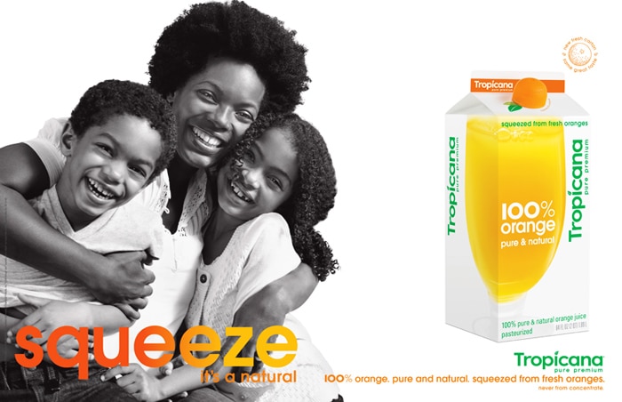
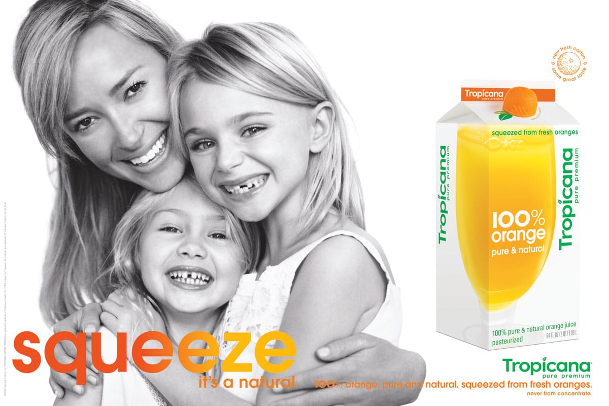
The images:
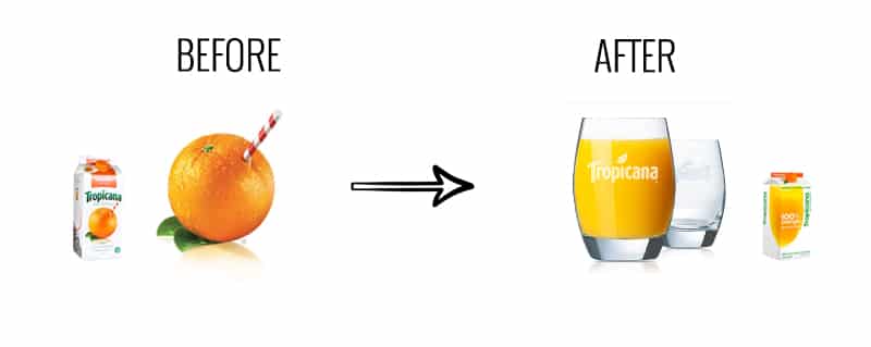
Perhaps one of the most important changes is the fact that a big transparent glass full of orange juice replaced the orange and its straw.
“Historically, we always show the outside of the orange. What was fascinating was that we had never shown the product called the juice.”
The lid:
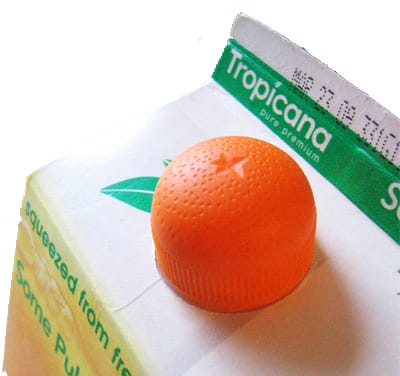
The agency decided to take the orange and move it to the lid of the bottle. The idea is very creative and interesting, as we can see that the cap really has the shape and texture of half an orange that you can squeeze to obtain a fresh orange juice. This message goes along with the new advertising campaign launched by the same time, and both the packaging and the ad include the statement “Squeeze, it’s a natural”.
“We wanted to take the orange and put it somewhere. We engineered this interesting little squeeze cap here… so that the notion of squeezing the orange was implied ergonomically.”

The logo:
![]()
Another important difference between the two packs is the new logo design.
The original one was horizontal and followed by the product name “Pure Premium”, while the new logo is vertical with a simpler and more modern font. The logo size was also reduced to highlight the message: “100% Orange Pure and Natural”
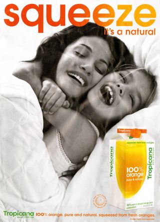
The advertising campaign that was released with the new packaging design
Tropicana released a new advertising campaign along with its packaging strategy. The main message communicated in this campaign was “Squeeze, it’s a natural”.
“The whole idea of ‘squeeze,’ ” Mr. Campbell said, is to play up “the functional benefit” of orange juice in providing fruit for people’s daily diets “and the emotional connection people have with Tropicana.”

Understanding the consumers’ reactions: what went wrong?
Emotional bond with the brand
“We underestimated the deep emotional bond they had with the original packaging” […]“What we didn’t get was the passion this very loyal small group of consumers have. That wasn’t something that came out in the research. […] Those consumers are very important to us, so we responded.” explained Mr. Campbell, president at Tropicana North America in Chicago.
The role of packaging in purchasing decisions processes
Perhaps the problem goes beyond this emotional bond consumers had with the old packaging.
It is very important to consider the role of packaging design in branding and its link with merchandising. Young and Ciummo stated in their article that packaging redesigns often come with a small decrease in sales, but this tends to be temporary and has never been as severe as the 20% decrease experienced by Tropicana.
In this case, many consumers didn’t recognize the product on supermarket shelves. Some loyal consumers saw the “100% Orange Juice” and asked themselves if the product was still the same as the Tropical Pure Premium they always trusted. Then appeared a series of confusions in consumers’ minds who lost their main reference elements to recognize the product. These include:
- The orange with the straw
- The original logo
- The focus on “100% Orange” instead of “Pure Premium”.
The look and feel of the new design
Because the packaging had a more simple design than the original one, most consumers described it as “ugly”, and explained it seemed to be from a low-range supermarket brand. Consumers were confused by this new look that made the brand look cheap, considering that Tropicana had always been perceived as a premium brand.

What to learn from this case study:
Branding is a complex subject and it is often difficult to predict the market’s reaction to a strategy change.
However, I believe that both from an individual and company-standpoint, we can learn several lessons from Tropicana’s strategic mistake:
- Consumers feel an emotional bond with the appearance of the product and brand they love.
Consumers have an emotional connection with brands they purchase and can feel betrayed and disappointed if they suddenly can no longer identify with new brand elements of the packaging design. It is important to always consider this before making changes to packaging designs.
- Branding elements on packaging cannot all be changed at once
Tropicana, while trying to modernize the brand, didn’t respect one of the most important branding rules any company should consider: the product identification and recognition by the consumer.
Tropicana changed too many brand elements at once. This confused the customers on the moment they wanted to purchase orange juice:
-
- new logo
- new typography
- new slogan
- new image
- new lid
If you want to redesign your product’s packaging, make sure you do not change everything at once. The changes need to be done progressively to ensure the consumer will still recognize the brand.
Of course, this only applies to successful brands such as Tropicana. If your brand and product are not doing well, a total rebrand can be a good solution to save the product on the market. In fact, we’ve seen many cases (Herbal Essences comes to mind) in which significant packaging changes have driven sales.
- Packaging is the silent salesman
Packaging is the last communication channel brands have with consumers in the purchasing decision process. Its design and content are essential to the brand because it will influence the consumer’s decision at the last minute. Tropicana’s consumers didn’t recognize or like the new product design and therefore decided not to purchase it.
- Advertising and Packaging Design have different communication rules
Advertising and packaging design are very different communication tools.
- Through advertising, companies have more time and support to communicate emotions and new values. The mission of advertising is to inform and communicate sensations that will last in the long-term. It is a more flexible communication channel over time.
- Through packaging design, companies need to communicate in a more direct, clear, and identifiable manner, as the consumer is about to make its final purchase decision.
Of course, packaging and advertising strategies should always be in line, as with any marketing activity in general. However, there are some communication codes for each domain that need to be respected. In the case of Tropicana, the packaging codes weren’t, and this caused the failure of the new design.
Conclusion
The Tropicana redesign illustrated the considerable power of packaging. While this was a distinctively negative example, it’s important to keep in mind that this same power does often work in a positive direction.
The takeaway for marketers and brand strategists should be even greater respect for packaging design and a deeper commitment to leveraging this brand asset with a methodical procedure. This will ensure consumers accept the change in a positive manner!
References:
– Online: CBS News, NY Times, NY Times (2)
– Marketing Journal: Young Scott y Ciummo Vicenzo. “Managing risk in a package redesign: what can we learn from Tropicana? “. Brand Packaging (August 2009).


The original design makes me think of orange juice.
The new design looked like the generic no-name OJ that’s created by mixing water with concentrate.
As for the posters, I don’t associate juice with hugs. Conversely I don’t like the imagery of cutting my loved ones in half and squeezing the life out of them for breakfast. Those posters just make me go WTF??
Hello Alex! Happy to hear your comments! Your opinion about the packaging designs and posters is very interesting. Do not hesitate to share your views again on other articles of the site :)
I think a lot of your recommendations are far too general. I’ve worked with clients scarred by the Tropicana ordeal and they’ve taken away similar “don’t change too much” lessons.
To me, the Tropicana case came down to leaving a powerful visual asset for a weak one. Yes, it was also about recognizing the brand but, let’s say the brand started with a generic glass of OJ. Then, it was faced with a new equity, that was built through years of television spots, of a straw in an orange. Would the brand owners then say, “no, too much of a change”?
Not all equities are assets. Trop traded an asset for a (generic) liability. It walked away from a brilliant visual metaphor of drinking right from the orange. Such evocative visual meaning is rare. Shame on Arnell and the brand owners for missing that.
Unfortunately, so many Pepsi folks still hold onto the scars of this experience and resist change to a fault. It impedes the ability to greatly elevate their brands. Take a look at Starbucks redesign of Tazo Tea and rethink your advice that only weak brands execute revolutionary redesigns. It’s not the amount of change but, rather, the right change.
Our culture moves very quickly these days and progressive consumers reward brands that make smart changes. Tropicana was a dumb change.
Thank you for your comment Steven! Very interesting insights.
Big brands should indeed take some risks, I totally agree with you – especially with packaging, which is a very powerful tool. A great example is the Herbal Essences’ packaging redesign after changing their target market. The new design was very different but in that case it worked because they targeted a totally new type of people. It really depends on the case, and on the brand.
Very interesting! I’m currently learning marketing and this is a good read for me so thank you =)
I’m very curious about the Herbal Essence packaging re-design case, I’ve tried searching for the article but can’t find it =(
Thank you Claudia! We will try to write about the Herbal Essence packaging case soon!
Marion, the only thing missing is an easy to remember consumer contact number i.e. 1-800 ORANGE JUICE.
Hi Marion, It;s very amazing Packaging ideas i really love it Thanks
Indeed, the packaging is the silent sales rep on the shelf, and we should not underestimate it’s power. the major problem we are facing nowadays with marketers and the re-branding strategies that are not taking into consideration “the packing power” , the shape, the dimensions, the materials, the feeling that comes to a consumer once he recognize the product.
for all the marketers this is an amazing case study to read it before any re-branding brainstorming session.
Cheers !
The OBJECTIVE of the change was wrong too. The objective was to make the packaging new and modern, but not better. New and better are not the same thing, although advertisers are among the worst in mistakenly equating the two. It makes little difference to the costumer that the image is new, it is more important / relevant / meaningful / effective if it is of HIGHER QUALITY. In an effort to be meaninglessly new, they produced something of lower quality.
Hi Marion,
Very interesting case! I’d like to call the attention to a few aspects.
First, I did not get any lead about using consumer research to test the effects of such a change, before committing to it. Do you have any information about? Don’t you think this should a critical step to a methodical procedure intended to leverage brand value?
The other point is that, although you mention an emotional bond, your precise analysis focuses on the perceptual and attentional processes that make packaging modernization so trick.
Good post!
One critical issue we need to take into consideration is when you assume your target market is evolving or growing so you need to grow with them without backing this assumption with research.
Insightful*
Thank you for the nice and informative post.
Great Article. I really like it.
I love Tropicana. Thank you for sharing such a helpful article. :)
Interesting article about packaging design. it’s important to have memorable designs. This sounds useful if the design can also help enforce your brand so that it can be easily recognized.
They should have tested the new packaging and advertising with current customers and customers from the competition. My initial response to the packaging was:
1. confusion – couldn’t recognize the brand that I had always trusted
2. the packaging looked generic and the oj itself looks like “canned” oj – no fiber so I grew suspicious that the product has been “reformulated” to save the company money
3. it is really hard to read type that runs vertical (I have even had ads rejected for that from publications in the past)
4. I don’t associate fresh orange juice with hugs and squeezing my family
5. I remember being annoyed that now I had to compare and study everything on the packaging to try to see if it was even the same orange juice. I ended up not buying any orange juice for awhile.
6. I like a lot of pulp in my oj and it seems like it is getting harder to find that on the shelves
7. Health is my motivation for drinking oj – good source of vitamin C, good fiber, and it neutralizes the bad effects of processed meats (bacon, ham, sausage) if you are eating that at breakfast. It prevents the nitrates from turning into carcinogenic nitrosomines. Anyway, that is what I learned from my college professor many years ago and so I have always followed that advice.
100% – these failures (Gap included) come down to not communicating with their audience. Clients often think of testing as too expensive. These great failures showcase the cost of not testing. Creatives hate testing but Strategists love it. As someone who does both Creative and Strategy, I rate it. It has to be done with the right people and asking the right questions.
I don’t feel anything wrong in it. I never underestimate the power of consumers, they feel connected with tropicana somehow. When the changes happen to major brands they curse at first and they start to feel that the change is needed and feel proud about it.
I agree the brand copy, visuals are not related to rebranded packaging.
Even that can be sort with a kick-ass marketing campaign.
For me it is a bold move and the attention to details are much appreciated. As an end-consumer I would love to sip a real tropicana. Delicious! and welcome a tone!
Not only was the “rebranding” a less than stellar attempt to “modernize” – the BIGGER issue is why ANYONE would spend $35 MILLION to do so. That decision alone should have been an indicator that those in charge were clueless. Ridiculous.
1. The juice is yellow. No longer looks rich.
2. The white carton lacks a defined contour and “hides” on the shelf.
3. The fruit identifies the product.
4. As mentioned, the vertical type and absence of heritage brand identification was a significant branding error.
Thank you for such a great article. Keep it up.
Thank you for your wonderful blog. It’s really a helpful blog for us. And I hope you will write more!
Thank you Marion for the article, it helps me a lot because i just start to studying about branding for business :D
Very insightful article! Thanks for sharing! The Tropicana case does prove that packaging makes a big difference in some way! Unlike packaging design from scratch, repackaging is to walking a fine line: how to appeal to new consumer groups while retaining the old ones!
Props to Debbie Millman for the original design!
Thanks to you for guidance an amazing way. Informative post.
Best,
Diana
“Stick a straw in an orange and drink it down” is a superlative visual presentation of an implied benefit. They don’t come much better. You could put it in the Branding Hall of Fame and retire the category. The redesign broke the customer’s recognition of a familiar consumer packaged goods brand at the point of purchase. That’s asking for trouble.
“…What was fascinating was that we had never shown the product called the juice.”
There’s a reason for that. Orange juice is a literal commodity (any unit is essentially indistinguishable from any other unit). Who the heck cares?
Beware the Smartest One In The Room, folks. They’ll get you killed, every time.
Thanks for sharing information. I really like it.
There’s also the fact that the old design was all curves. Curves are evocative of oranges, natural and nature-based shapes. Oranges are round. Enough said. The old Tropicana logo itself brings to my mind a kind of orchard canopy overhead. The package evoked the feeling of sitting in the shade of a Florida orange orchard sticking a straw in an orange to take a refreshing sip.
The new design is all lines. It removed all visual clues that this is a natural product. It went from nature based to mass-produced, accentuating the shape of the box, instead of the shape of the orange. All the reasons you list are true as to why it failed. And just as much so because of the 100% switch from curves to hard lines.
Really good article! I am a student of marketing and searched for that kind of article. A brand faces many challenges and at least it succeeds. Thanks for sharing this kind of article once again it was really informative.
Impressed! The article is very good and impressive. Every brand faces some difficulties but one day it becomes stronger. Ups and downs happen in everybody’s life. Thanks for sharing this kind of article.
Great Article. I really like it. Always waiting for the new article like this
One of the most helpful articles I’ve read. :)
Some very helpful insight there for anyone in the design and branding industry!