Reebok is back in the game with its new “Delta” logo unveiled a month ago, as part of the brand’s new positioning which focuses on fitness. The company is trying to move away from the professional athletes who were the main target market of the brand in the past. Today, Reebok aims to encourage everyday people to do sports.
Announcement: Our practical course 'How to Build a Successful Brand' is launching soon. Join the Priority List now for a $150 Discount and be notified when we go live!
Table of Contents
Reebok and its strategy
According to its official website, Reebok International Ltd. is known to be a “leading worldwide designer, marketer and distributor of sports, fitness and casual footwear, apparel and equipment”. In 2006, the brand was purchased by Adidas for 3.8 billion dollars. However since then, Reebok hasn’t been very profitable. In order to increase sales and differentiate the brand from Adidas and Nike, the company decided to launch a new branding strategy by focusing on an emerging niche market: the CrossFit movement.
For those who have never heard of CrossFit, this term has been defined by the Reebok CrossFit BCN website as a new training program devised by fitness experts in the US. It helps achieve several goals (weight loss, strengthen and tone muscles, increase cardiovascular fitness) by focusing on all physical skills equally. Julie Cruz explains that CrossFit, “has seen its popularity swell in the U.S. and Europe in recent years as people get hooked up on both its speed and being pitted against others”. Because CrossFit fanatics tend to purchase a lot of sport clothing and accessories, this new target market could be very profitable for Reebok. Also today, no other brand focuses on the needs of these specific consumers.
So why this new logo?
“It’s not a logo; it’s a symbol… a way of life”, explains the brand in its official press release. Today the brand does not focus on speed and performance but on change and transformation. The three sides of the CrossFit Delta chosen by Reebok represent the physical, mental and social changes that occur when people practice hard.
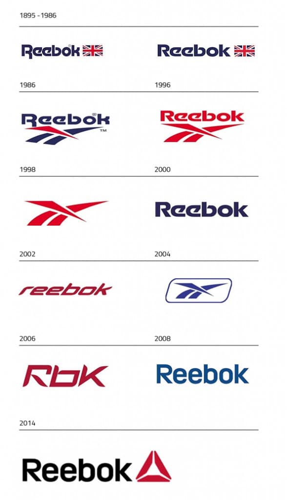
The Reebok Delta is the third symbol used by the brand. First of all there was the Union Jack flag, which portrayed the company’s beginnings in England in 1895. This original logo was then significantly redesigned in 1986 with the use of the famous “vectorial” symbol.
Some people might think his new symbol used by Reebok isn’t that creative. From my point of view it clearly represents the CrossFit movement and it is also totally in line with Reebok’s market shift towards the fitness orientated market-niche.
What about you, what do you think about this change in Reebok’s logo design?
References: Bloomberg, Reebok Official Website, Reebok Cross Fit BCN, Grapheine, Branding Magazine.
Most of the pictures are screenshots from the official Reebok video, the logo design evolution was found on Grapheine and the featured picture on Creatividads.







Great info. I only recently purchased Reebok after about 15 years since my last purchase. I was wondering about this. I live my purchaser too.