

Nobody really likes change and for a long standing popular tourist attraction in New York, changing the branding of the Metropolitan Museum of Art, (which hasn’t changed since 1971) can cause quite a stir. The re-brand for this project consisted of a new logo and all visual and written communications including their website to follow.
1) Why a new image after so many years
It’s unusual for a company to not change their branding for a number of years but of course “if it isn’t broke, don’t fix it”. However, in order for any brand to stay current, remain popular and communicate with their target audience a time for change needs to come.
Design agency Wolff Olins is responsible for the re-brand and the new identity which according to Design Week: The Met says the new identity will be part of “a clear graphic language” that will “create greater clarity and consistency in The Met experience and communication across all its locations… and online”.
I agree that brands have to evolve, they have to grow and adapt, especially into the digital space but there has been some criticism over the strategy behind the re-brand.

2) The Met’s Strategy Flawed
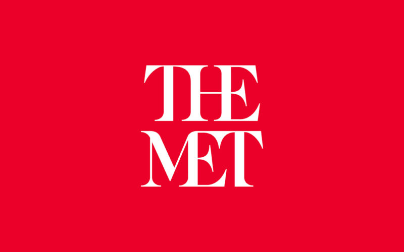
When the new logo was released there was an outcry from art lovers around the world about the loss of the 146 year old “m” logo being replaced by the words “The Met” and in a striking red colour and serif font.
Of course not everyone likes everything all of the time, we’re well aware but as a strategy for launch both the design team and the marketing team involved needed a much stronger communications plan to get people on board. To explain the rationale and also to demonstrate that these changes were based on research from their visitors.
Instead, they faced a backlash against the rebranding which resulted in The Met providing a statement almost defending their position rather than communicating the brand in a positive light.
3) Rationale
Delving into the strategy behind the re-brand, the change from the letter “m” was made due to the feeling that it focused more on symbolism and they wanted to move away from this and focus on connecting the classic with the modern. People often refer to the museum as “The Met” so this brought in the modern, with the use of the typography connecting it to the classic.
This strategy is clearly thought out, logical, showing an appreciation of the architectureBrand architecture defines the role of each brand and acts as a guideline for the interrelationship between the brands in your organization. Learn more and how to portray this in their visual identity.
The Met want to create clarity and consistency, showing an adaptable brand platform used throughout all of their communications.
4) What next?
For The Met, they are standing strong against the opposition, the re-brand is the right thing for the Museum and they stand by their strategy, commenting in the Observer, The Met said, “There may be debate about the logo because it involves change, but the Museum chose it because it represents something simple, bold, and indisputable: The Met is here for everyone.”
But the reality is their communication strategy for their re-brand hasn’t worked. It might look fresh, clean, encompass the classic with the modern, representing the collections inside the Museum, but without the communications strategy to support this, the branding strategy was always going to come out in a poor light. Companies no matter how big or small need to remember their audience when it comes to branding, and changing something after 146 years, communicating your brand to your audience is a necessary must.
Only time will tell if this re-brand can stand the test of time.
References: Design Week, Under Consideration, Observer
Pictures from : Design Week, Observer


Thank you fro writing this incredible article. However; I noticed in this part: “logo being replaced by the words “The Met” and in a striking red colour and sans serif font.” there is something wrong, because the typeface used in the new logo is serif not san serif.
Thanks Kaltham! Well spotted – we’ve updated the article accordingly.