Proven Systems for Business Owners, Marketers, and Agencies
→ Our mini-course helps you audit and refine an existing brand in 15 days, just 15 minutes a day.
→ The Ultimate Brand Building System is your step-by-step blueprint to building and scaling powerful brands from scratch.
Table of Contents
It’s a brand new day
Verizon, the largest U.S. wireless communications service provider, updated its 15-year-old logo with a new identity last September as part of a broader initiative to refresh and re-energize the Verizon brand. The new identity, designed by Pentagram, has been positioned as an evolutionary move to modernize the company’s look and feel.
It’s not clever of flashy
According to Michael Bierut, partner at Pentagram’s New York office, “It isn’t intended to be clever or flashy. It’s really supposed to acknowledge its role as being ubiquitous as a kind of brand with a big footprint and one that isn’t trying to add to the visual noise around us”.
From Verizon’s perspective — “The new logo is a visual statement that honors our history and reflects an identity that stands for simplicity, honesty and joy in a category rife with confusion, disclaimers and frustration. It’s a clean, more human design and the checkmark, the universal symbol for getting things done, uniquely expresses the reliability of Verizon.”
No shortage of criticism
The moment that the new logo was unveiled the design community was quick to find fault that ranged from boring, ordinary, plain, out-of-date, seen it before, and my 4-year-old could have done it. Even T-Mobile’s boss, John Legere, jumped on the bandwagon.
In his Twitter posting within hours after the unveiling of the new Verizon identity he commandeered the new checkmark to emphasize what Verizon is doing wrong: “screws over customers; data overage penalties; keeps all unused data; no early upgrade options; and hefty fees for international roaming.” OK so no one’s perfect.
But then the prevailing opinion of the old logo was that it was even worse. Critics have cited that the new logo has taken the worst of the old and carried it forward into a new but underwhelming identity.

What’s a logo to do?
The debate on the merits of the refined Neue Hass Grotesk type or the revamped simpler checkmark could easily drag on until the next-generation Verizon logo is introduced. Design, of course, is important but what about the role of the logo in respect to its responsibilities as a symbol of the brand?
According to Verizon’s chief marketing officer, Diego Scotti: “It does what a great logo does best. It evokes both what we offer, and who we are.” According to Verizon the logo symbolizes a reflection of how Verizon is evolving and reinforcing its renewed purpose to deliver against services in a simple and reliable manner that customers want. “We deliver the promise of the digital world and we need a logo that expresses our purpose in a way that is truly ours.” The question, then . . .does the new logo truly reflect the brand?
The brand filter
The brand, of course, is a function of what it aspires to be and what others view it to be. So the brand test is not a simple one. However one way, of many, is to consider the answer to that question relative to aspirational brand attributes. A simple exercise is to identify key descriptors extracted from how Verizon describes who it is, what it stands for and what attributes it desires to have associated with it.
According to Verizon it positions itself as a problem solver and innovator that connects millions of people, companies and communities around the world. It promotes speed, power and innovation as foundational attributes of its networks. Its culture is guided by the “Verizon Credo” — a set of principles built around integrity, respect, performance excellence and accountability. Corporate values are predicated on creating a simple and smart customer experience at every point of contact.
Owning attributes
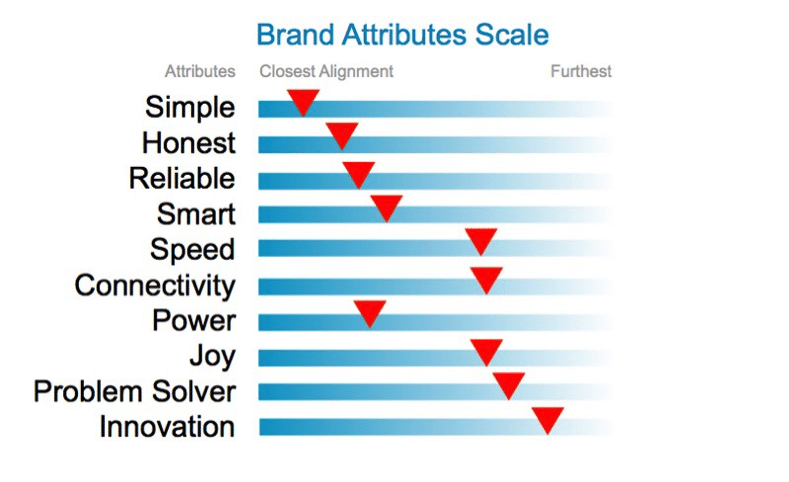
If these key words are combined with others that have been used to describe what Verizon seeks to be known for it is possible to create a Brand Attributes Scale. This simply lists the key attributes and the degree to which the logo aligns with those attributes. This relies on associating certain characteristics in the logo design with attributes on the scale. For example, the characteristics of the typeface are fairly simple without the flourishes of serifs or other elements, which might otherwise be seen as more complex in execution.
Therefore the design could be seen as aligning very closely to Simple. This is not scientific by any means but is one tool that can be used to provide a degree of objectivity as to how well a logo aligns with the brand through shape, color, format, and other visual elements that have connotative associations.

Branding is more than a logo
A logo, of course, can’t be expected to do everything. It is only one part of a greater whole. The “Better Matters” campaign, created by Weiden + Kennedy, is also working to support what the brand is intended to stand for — simplicity, honesty and reliability. The “Better Matters” campaign takes a very pragmatic approach to messaging on why a better network simply translates to cell phones that actually work better — and that’s what ultimately matters to customers.
While the logo might reinforce the attributes of simple and honest, the campaign supports the attributes of reliability and problem solving. Looking at a more holistic approach to brand communication is a more effective way to evaluate how well a new branding initiative is working over and beyond just the logo design.
A good branding practice is one that deploys different brand attributes across an array of system elements and messaging platforms to create a broad-based and complementary brand communication strategy.
Design is still important
It is not intended to discount the importance of good design. The logo is one of the most important symbols of the brand and, as such, it needs to be designed well and adhere to the principles of design to ensure that it fulfills both strategic and functional considerations.
However, regardless of how great the design might be, or not, . . . a logo won’t change who or what the company is.
References: Adweek, Adage, Pentagram, Verizon (Our Company, Who We Are), Verizon (Our look is evolving along with our customers), Fox News
Pictures from: The Huffington Post


Nice article and very good analysis!
Very clear analysis. Thanks.
I live in Europe and discover Verizon and of course its logo for the first time.
To be honest I find the new logo very powerful by design: the name + the checkmark. The checkmark, aligned with the top line of the name reinforces the reliability of the company.
A clear logo also improves the S/N (signal to noise) ratio, a fundamental subliminal concept for a telecom company. No noise, just the name and the checkmark. What else do you want?