
Last week, Google surprised everyone with the announcement that it is rebranding itself as Alphabet and hence changing its brand architectureBrand architecture defines the role of each brand and acts as a guideline for the interrelationship between the brands in your organization. Learn more. Alphabet is meant to be the tech’s giant parent company, with Google as its largest subsidiary (managing popular services such as search, maps, YouTube, and Android), but also other direct divisions such as Nest and Ventures.
The new Alphabet brand architecture model
“What is Alphabet? Alphabet is mostly a collection of companies. The largest of which, of course, is Google. This newer Google is a bit slimmed down, with the companies that are pretty far afield of our main internet products contained in Alphabet instead. What do we mean by far afield? Good examples are our health efforts: Life Sciences (that works on the glucose-sensing contact lens), and Calico (focused on longevity). Fundamentally, we believe this allows us more management scale, as we can run things independently that aren’t very related.” explained Larry Page, CEO of Alphabet in the company’s press release.
The new Alphabet umbrella aims to:
- Give investors more transparency about its structure and different businesses.
- Separate business activities that had nothing in common.
- Give an entire focus on each division of the new holding
- Make each division grow into its own brand. “While the media and advertising business will keep the Google name, other facets of the company that aren’t big moneymakers like Nest, Google X (the company’s “moonshot factory” spearheaded by Astro Teller) and its investment branch, Google Ventures, are essentially distancing themselves from the Google name and will be lumped into Alphabet.” explain Advertising Age.
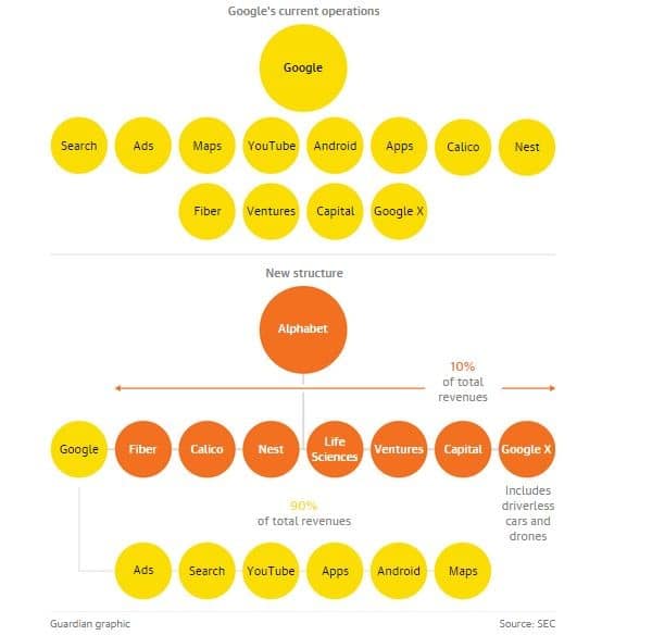
The Guardian recently unveiled an image that clearly illustrates the new company structure and brand architecture versus the previous one:
More than just a simple name?
The Alphabet name was chosen for two main reasons:
- It means a collection of letters that represent a language
- Alpha-bet can also mean “Bet for Alpha” (Alpha is investment return above benchmark) which is what the company aims for.

How people have reacted to the new company’s structure
At first glance, it’s a strange marketing move, but branding experts say the new structure will not damage Google’s brand. “This takes a brand that has become so popular it is now a verb and wraps it in a noun the world can immediately understand,” said Toby Southgate, worldwide CEO of Brand Union. “It’s brilliant.”
Other claim that the name Alphabet makes a lot of sense for the brand as it already used the concept over the years. As an example, Google’s Android operating system update names have evolved alphabetically since 2009.
However, Alphabet, besides simply being a common word used in search engines, is also already the name of several brands worldwide. For example, Alphabet it’s the name of a fashion company, an accessories business, a decoration retailer, a hotel, an international car management company, a signage company, and a design firm. Similarly, some brand like Amazon and its subtle “a-z” reference in its logo or Campbell’s famous alphabet soup, have an alphabet-themed brand or product. This causes signs of confusion and indignation on the internet.
Conclusion
With Alphabet, the company is clearly creating a solid and essential architecture for the corporation. The new umbrella allows the group to define clear goals and structures for each one of the subsidiaries but also allows Google to focus on its core business – internet, software, and online advertising.
In terms of branding strategy, however, I believe the corporation should have found a more unique name, far away from other companies’ names. The name Alphabet is very simplistic and doesn’t really reflect the uniqueness of the corporation (long-term view, transparency, focus on humanity, diversification, etc). Also, it is already the name of several other companies, and this could create strong legal issues. The corporation could have been a little bit more imaginative. The website address for the new group, however, is quite creative and memorable: abc.xyz
To conclude, the overall corporate strategy is clever and makes a lot of sense at the stage where the organization is becoming very big and diverse. However, the branding strategy itself could have been more polished and original. I hope that the group has plans on further developing the brand identity in order to make it unique and relevant to its different stakeholders.
References: Investors Google, Adweek, Slate.com, Sfgate.com, BBC, Fayer Wayer, Marketing Magazine
Pictures from: Fayer Wayer