

HP will soon separate into two companies. On april 15th, the corporation unveiled the brand identity of half of the company – Hewlett Packard Enterprise.
While HP Inc. will sell consumer-focused offerings (such as PCs, printers and other),
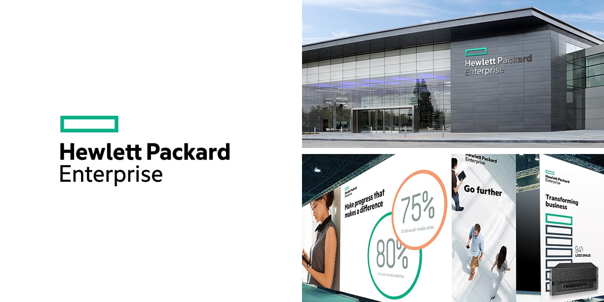
Hewlett Packard Enterprise, will focus on enterprise IT products and services (such as servers, storage appliances, networking gear and cloud solutions).
The objective:
In order to introduce the new half of the company, HP needed to create a new brand. The new logo for Hewlett Packard Enterprise was recently unveiled by HP CEO Meg Whitman.
The brand essence:
In a recent blog post, Meg Whitman described the essence of the new brand:
“We are innovators at heart – that’s in our DNA. We had to continue to bring forth the practical innovation we’ve always been known for – the pride we feel in inventing new ways to improve how we live and work. And, there are new elements we want to explore, like agility, openness and partnership with our customers. It takes more than great technology to succeed in the world today.”
The new logo:
To bring these values to life, the corporation designed a new logo.
“We needed a logo and a design system that would be singular and defining. We needed a design that would express our renewed commitment to focus and simplicity. And we needed a logo that would be as transformative, flexible and agile as we are becoming, while standing out from the pack. Finally, the logo needed to work across all the ways we would use it.
It’s different, I know. What I love about our new logo design is how it stands out among our competitors. The color we picked is no accident. I wanted us to stand apart.”
This symbolically reflects the partnership between clients, partners and employees to do business together.
Conclusion:
Because the company decided to split in two, it is very interesting to see how the corporation imagined the new brand. The recent article published by Meg Whitman unveiled just the beginning of a visual identity for a new brand, by starting with the logo.
However if the logo reflects the value of simplicity, I am not sure it is the best choice to show the sense of innovation of the corporation. In my eyes the new color and graphic line chosen are too serious and corporative.
They also somehow remind me of pharmaceutical brands. This logo doesn’t really stand out from the crowd, and I believe HP could have done a much better job by introducing something more elaborated and eye-catching. Perhaps with a more modern touch, and a more meaningful symbol than just a simple green rectangle..
What about you, do you like the new logo?
How would you imagine Hewlett Packard Enterprise’s new logo?


I love the new logo! Its clarity and simplicity really stand out. My first thought when I saw the logo my thought symbolizes storage which is part of business. It also effectively represents boundaries..