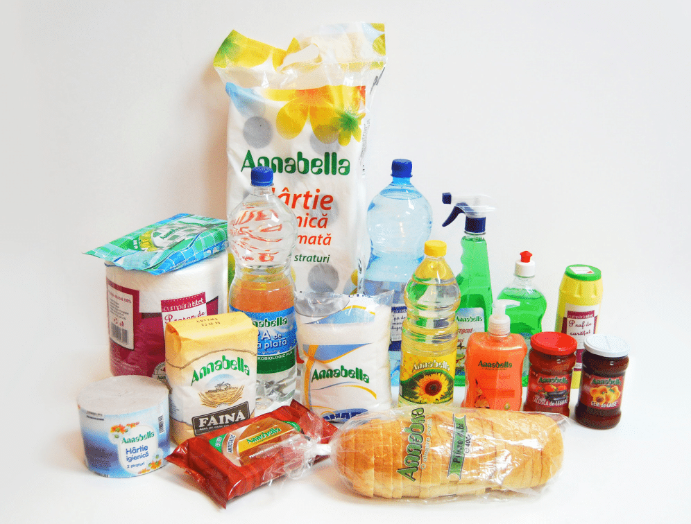
Since 1994, Annabella has developed a network of retail stores in Vâlcea, a county in the heart of Romania. Twenty years after the first store opening, Annabella planned the launch of its 50th store, which would be built from scratch in order to truly reflect the brand identity. In addition, the retailer decided to rebrand its unique label brand with a new name and a redesign of the entire portfolio of products. This decision was accompanied by a portfolio extension towards dairy, sweets, and canned meat products, amongst others.
The challenge
The main challenge for Annabella was to come up with a new name for its private label brand; a consistent packaging design for the entire portfolio of products and a new in-store design that would reflect the friendly attitude and warm approach of Annabella towards its customers. This positioning is what allows Annabella to differentiate itself from big retailers in the country, and so, they wanted to reflect this in their rebranding strategy.
The agency chosen for this strategy was Brand Fusion Romania.
The new brand strategy
Proven Systems for Business Owners, Marketers, and Agencies
→ Our mini-course helps you audit and refine an existing brand in 15 days, just 15 minutes a day.
→ The Ultimate Brand Building System is your step-by-step blueprint to building and scaling powerful brands from scratch.
Table of Contents
1) The label brand
Naming: “Annabella Zilnic”
Up to this point, Annabella only had one own-brand label, for entry level, which was simply the retailers’ name. Brand Fusion Romania had to come up with an additional name alongside “Annabella” for the own-label brand, which would offer the possibility for the retailer to develop further private labels in the future, with a different name for each range.
This own-label brand named to reflect a multi-category portfolio of products and to be relevant to the entry-level prices of the brand portfolio, which are basic products for daily usage.
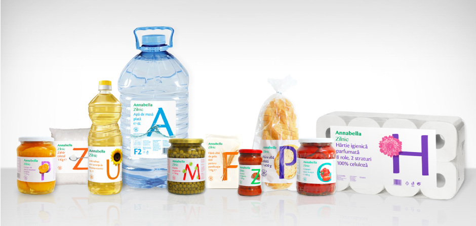
Therefore, this specific label brand was renamed “Annabella Zilnic” (meaning Annabella Daily). This clear and unsophisticated name reflects the idea of simplicity and daily-use of the portfolio of products.

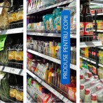
Packaging design
The brand needed a new coherent packaging design that would correctly reflect the price positioning of the Annabella Zilnic range in the affordable segment within the whole multi-category range of products.
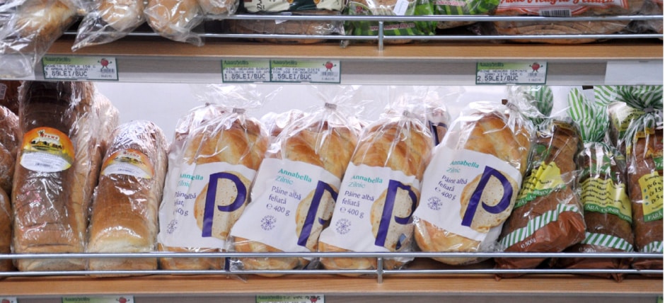
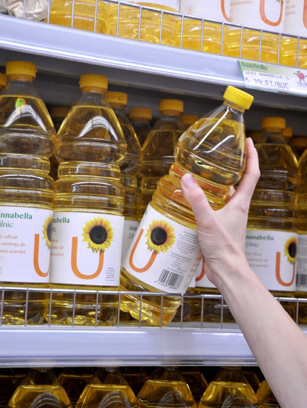
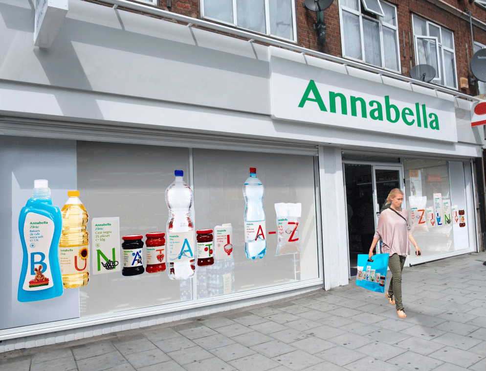
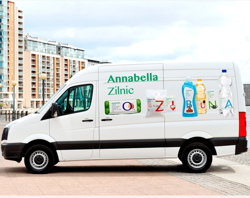
The new packaging design focuses on the ideas of basics and diversity. The design is based on the letters of the alphabet, with each product showing the first letter of the keyword that defines it. The alphabet was used to illustrate the idea: “all you need everyday, from a to z”.
The visual aspect of the packaging shows the image of the product interacting with the letter. The result is modern, clear, simple, and allows the brand to be clearly visible on shelves, with a unique, friendly and fun attitude.
The packaging design before:
The packaging design after :

2) The New Retail Store

Naming: “Annabella A-Z”
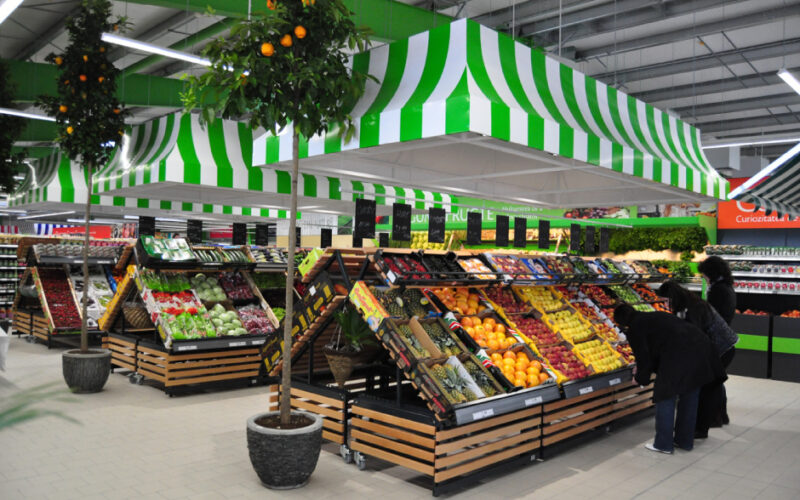
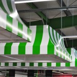
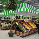
The new store differs from the previous ones with a new format (large hall, parking area, a surface of 2000m2). The shopping experience is therefore different as customers are more likely to go there by car for their weekly shopping. To name this new store, Annabella chose the descriptive word A-Z instead of the traditional “XL” or “market” names. A-Z reflects the idea of diversity in a bigger place, where consumers can find everything they need.

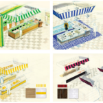
Store Design
The store design had to illustrate the values of proximity and friendship. Dorina Mutu, Executive Director at Annabella, explained: “We are friendlier, our roots are here and we have people you can count on. If clients are unhappy about something, they come and tell us and it gets solved in no time. We know each other and we have a close bond with our clients.” (cited in Brand Fusion)
The new place is therefore welcoming and designed as if consumers would be at their usual butcher’s shop, fruit store or fish market. The new Annabella supermarket is colorful, structured, light, and presents unique textures and proportions.
The colors chosen in-store make the place look lively and cozy. Each product category has been assigned to a specific color in order for shoppers to quickly find their way in the store.
Structure-wise, the pillars are green for a feeling of freshness, and the store has been divided into different spaces covered by striped awnings, in the style of a farmers market.
“Each service area is designed as a store-within-a-store. This is expressed through the mosaic flooring, the awnings, the decorative elements imo for pc Latest and the employee uniforms, all personalized differently according to each area.”, explains the agency in its report.
The different signs are straightforward and colorful, but not aggressive. Everything about the new design brings a personal touch to the store and removes impersonal feel of big look of big supermarket chains.
The store design after the rebranding strategy:


The Results
The overall strategy was very successful as reflected by the following outcomes:
- A new label brand name that allows Annabella to develop future label brands such as organic or more premium products.
- A packaging design that is consistent across the portfolio and easy to identify on shelves thanks to the big and visual letters.
- A new store design that offers a new shopping experience for consumers, but still presents the idea of proximity and a friendly environment
- After only two months following the launch, the brand recorded an increase in 34% in sales for Annabella’s private label portfolio of products.
- For specific products such as peach jam and canned vegetable stew, the sales more than tripled.
References: Rebrand, Brand Fusion Agency (Project Annabella Zilnic), Brand Fusion Agency (Project Annabella A-Z)
Pictures: Rebrand, Brand Fusion Agency (Project Annabella Zilnic), Brand Fusion Agency (Project Annabella A-Z)