Anakena is a Chilean wine brand owned by the Australian producer Accolade Wines. The brand, located in the Cachapoal Valley in Central Chile, aimed to create new packaging and establish a new brand strategy, including naming and storytelling, to better represent its brand identity.
DAf, a specialized creative agency with offices in Santiago, Chile, and Barcelona, Spain, was selected to lead this project.
50 Video Lessons | In-Depth Workbook | Templates | Support
Our course The Ultimate Brand Building System is now open for registration. Enroll today to stand out in your market and create a future-proof brand!
Table of Contents
The Challenge
Accolade Wines wanted to develop new packaging designs for their Anakena range in Chile, and to create a new brand strategy, including naming, storytelling, and creative for the line.
The company emphasized the importance of recognizing both the wine’s terroir, located in Alto Cachapoal in central Chile, and the origin story of the Easter Island birdman depicted on their label in this redesign and creative process.
Anakena wanted to appeal to the millennial market by positioning itself as an exciting option in the New World wine category, which refers to wines produced outside the traditional wine-growing regions of Europe.
The goal was to increase global distribution to build the brand in key markets including the US, Canada, Latin America, Japan, Korea and China and to relaunch completely in Europe.
The Brand Strategy
Brand Origins and Symbolism
The brand Anakena has a unique story rich in symbolism. It derives its name from a beach on Easter Island (or Rapa Nui, as it is locally known). In Rapa Nui culture, the name Anakena means ‘bird cave’ (based on the birdman legend).
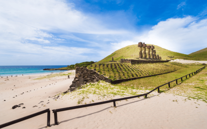
The brand’s symbol features a birdman inspired by a traditional contest among indigenous island groups. According to this myth, the Easter Island seagull, known as Manutara, would hide its valuable egg each year in a concealed hideaway or Anakena. Annually, men from Rapa Nui (Easter Island) would demonstrate their courage by swimming from Rapa Nui to the islet of Moto Nui in search of this egg. The person who successfully located and brought back the egg to Rapa Nui was honored with the title of “Tangata Manu” – the Birdman. This victorious person would receive recognition and prosperity for the entire year until the competition was held once more.
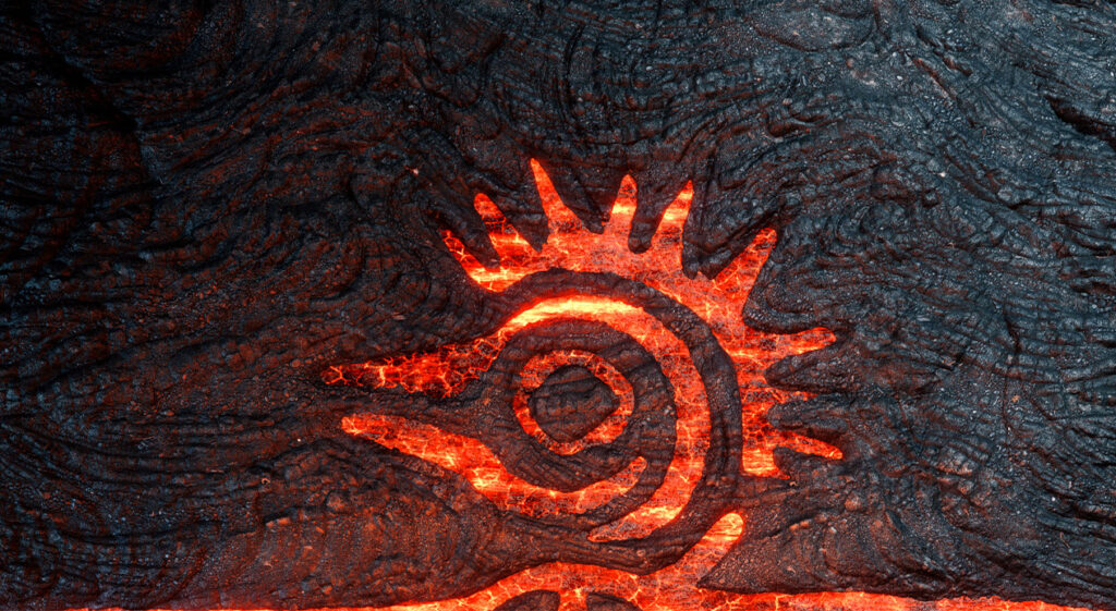
The soils in Alto Cachapoal, where the brand’s grapes are grown, are volcanic, similar to those on Easter Island.
As a result, the brand’s strategy emphasizes the wine’s unique connection to the terroir, including volcanic influences and the indigenous cultures of Chile. This idea was leveraged to create a new narrative, focusing on the imagery and force of volcanoes and the Chilean land as the inspiration for the new packaging design and other creative deliverables.
Brand Essence & Promise
DAf, in identifying the ideal consumer as a millennial who seeks out new experiences and excitement, crafted a brand purpose, essence, and promise for Anakena: to be the most exciting New World wine that stops at nothing to achieve greatness, a wine so powerful that not even lava can stop it.
This promise is designed to inspire and excite the audience, inviting them to embark on a unique and powerful wine journey.
Brand Story
The brand story shares the relationship between lava and this wine, with lava escaping from within the earth’s crust to form the terroir from which Anakena is created.
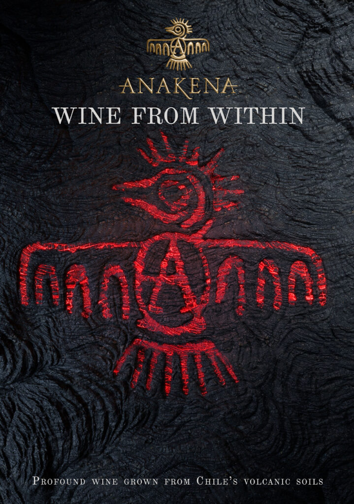
The full storytelling, included below, inspired the tagline “Wine from Within”, which encapsulates the brand’s commitment to producing wines that reflect the characteristics of their terroir and the passion and spirit of the people who make them.
“Chile is a land of extremes,
The Pacific island of Rapa Nui,
May seem a distant world to our home in Alto Cachapoal,
Yet we are connected by what’s inside.
Both are lands defined by fire,
Where lava once flowed, irrevocably changing the landscapes bringing depth and richness to our very existence
And its fire spirit lives on beneath the ground we walk on.
CAN YOU FEEL IT FLOW?
Our vines plunge into the depths,
Straining through the volcanic soils,
Harnessing the fiery force of what’s within and infusing our wines with heated spirit.
When you try our wines, go deeper.
Feel what’s inside.
Trace the taste back to the embers of these ancient lands
And soar from there.“
Product Naming
Anakena, in its commitment to respecting Chile’s native lands and peoples, sought to develop names for the various wines in the product range.
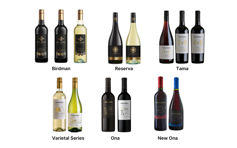
The agency, mindful of this importance, chose short words from different indigenous languages that are easy to pronounce and convey images associated with the wine: Alwa, Ona, Tama, Nuna, and Birdman. These included terms for spirit and community.
One wine received the name Birdman, an important character in Easter Island’s history and the Anakena symbol, further reinforcing the brand’s respect and value for Chile’s native cultures.
Packaging Design
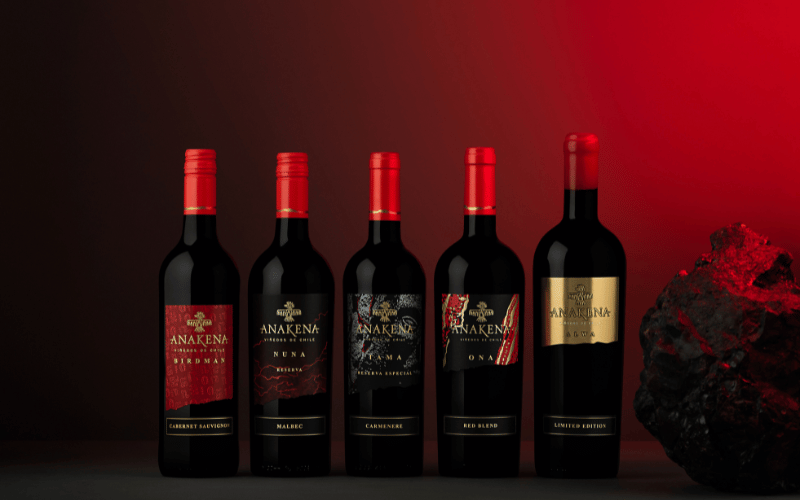
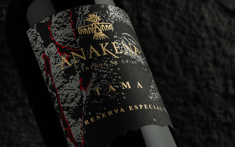
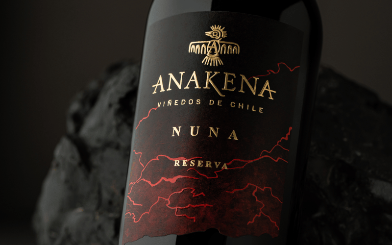
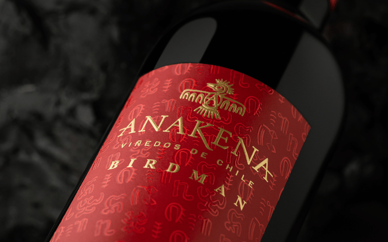
DAf designed new wine labels for the wines in Anakena’s range, using a volcanic color palette of hot red, igneous black and bright gold to tell the story of the wines’ powerful origin by referencing the lava, volcanic soil and precious organic material contained within the earth’s surface. The labels appear torn off at the bottom, in a nod to the jagged silhouette of the Andes Mountains, a prominent feature of Anakena’s terroir that adds to the unique character of the wines.
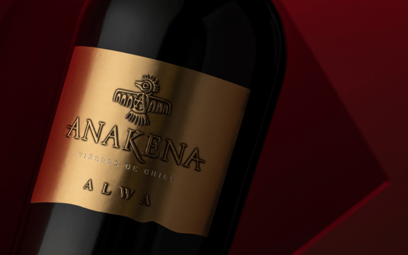
For Alwa, bright gold foil was chosen to reference Pacific sunrises.
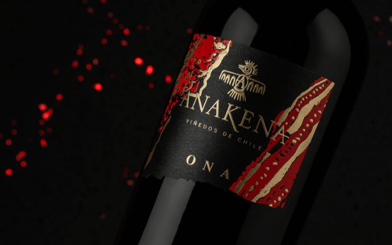
The label for Ona, a wine named for an indigenous people from Tierra del Fuego, has stripes inspired by body paint once used by this community.
Tama uses a stone background reminiscent of anthropomorphic, pre-Columbian carvings.
Nuna, which means soul or spirit, uses a black-to-red gradient with bright red lines running through it, as if a spirit was running through a night sky like lightning.
Finally, for the hero product, Birdman, DAf created a layer of fiery red underneath a layer of intriguing, mysterious rongorongo glyphs, ancient icons from Easter Island whose exact meaning is unknown to this day.
The Results
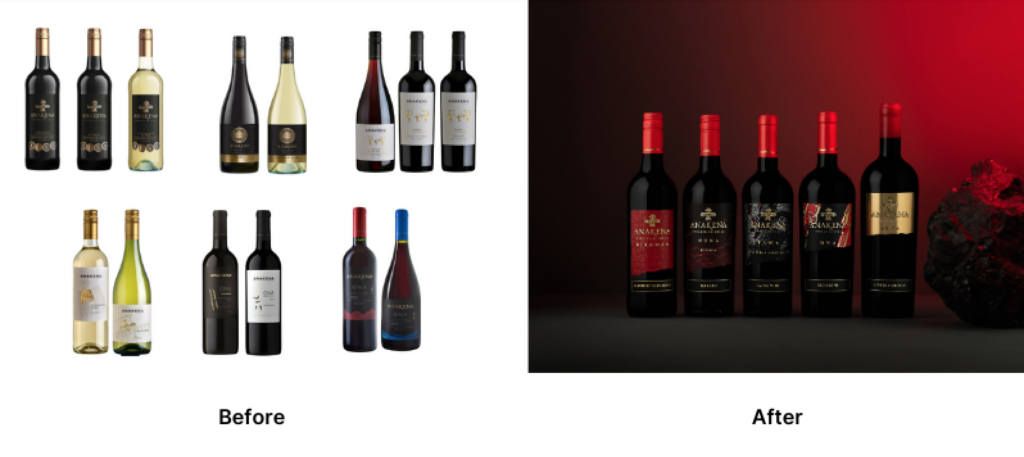
Starting at the beginning, with a well-considered brand strategy and appropriate storytelling, allowed for the creation of a cohesive brand identity across the entire product range.
This solid foundation then provided a basis from which to create new product names and labels, allowing DAf to give each individual wine its own personality while reinforcing the feel of the Anakena brand overall.


