No one likes change especially when you’re so used to clicking on your app of choice which you instinctively know by the placement on your phone, the colour of their logo, shape and uniqueness. So when Uber re-branded and changed their logo, for what some are believing to be “no apparent reason” you’ll be shocked to learn this did not go down well with their users.
1) The question on everyone’s lips – why?
Uber unveiled its new look logo when the app was due its update and it immediately caused a stir.
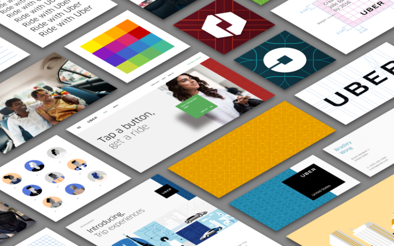
According to Uber the new logo was needed to show how the company had grown over the years, aiming primarily to represent bits and atoms…
However, what some feel it has lost, is its own identity, it doesn’t explain itself very clearly now to its users. There is no brand story or voice behind it in order for it to explain exactly what it’s all about.
2) The new logo

The central square in the new logo is being called “the bit” by Uber. This will be the one element of the logo which will remain the same throughout Uber’s apps and website. The interesting aspect is that the background and even the shape surrounding that tiny square will change to reflect a specific region or design theme.
Standing on Uber’s side for a second, it does sound like they’re acknowledging regional differences, appreciating that not everyone is the same and using the advancements in technology to zone in on user behaviour to reflect this in their logo – in this sense great branding, so why the outrage?
3) Change and communication
Uber have a bigger strategy and their logo and visual identity needed to tie into this and unite the two (sound familiar to the Coca-Cola re-brand?).
So to help them tie this together they came with the ‘story’ which focused on the ‘bits and atoms’ which they felt better explained and united their different services to different users.
In Uber’s own blog post about the change, they felt they needed a more mature logo, which showed how they had grown from the young start up to the globally recognised business they are today.
However, it is this original visual identity which has helped the company establish its branding, its connection with the consumer and helped them to grow and evolve. To change this to something unrecognisable with no link to the old design or in consumers’ eyes connection to the company, it might not have been the best rebranding move to make.

4) Your logo is your brand which connects you to your customer
Uber’s logo is their connection to their customer, people know exactly what they’re getting and it is this that has built their reputation as well as their business.
If a company is failing, struggling or in need or a complete refresh then yes, fully rebrand and change the logo to suit. To change the logo from something that works to something that the Chiefs think better reflects the company will never work – and this is the approach many feel Uber have taken.
They’ve not listened to their customers, zoned in on the usability and the behaviour their current branding evokes and use this to focus their re-brand around.
5) The problem with re-branding logos on apps
Recognisable, quick, easy to identify, simple – we don’t have time to search, we want things quicker and easier than ever before. Something that you instantly recognise, even if ever so slightly allows consumers to make quicker decisions, there is less anxiety about using the app to access the product/service and the relationship with the brand is hence created.
It is how this relationship is reached that is important to take into consideration when re-branding. If that’s already built and you change it, you do stand to turn away an awful lot of people.
It will be interesting to see the full extent to this logo change in a couple of months’ time, once the dust has settled.
References: Business Insider, Huffington Post, Daily Herald
Pictures from: Uber.com, Business Insider


