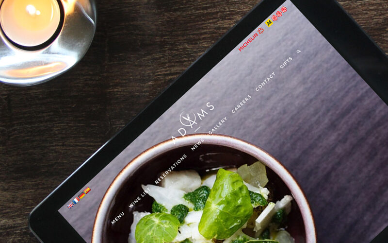
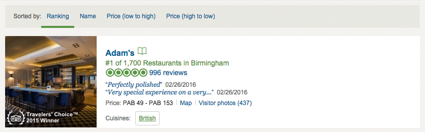
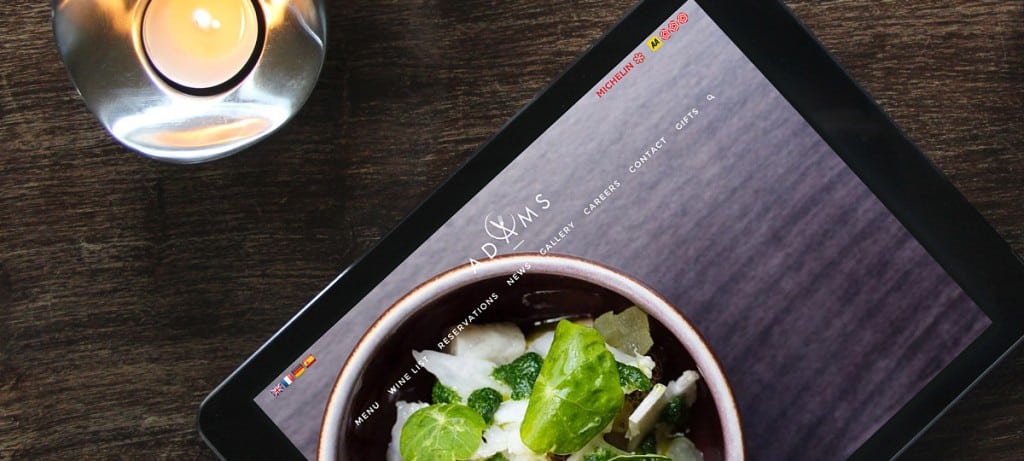
Adam’s is a Michelin-starred restaurant, named UK’s No.1 by TripAdvisor in Birmingham. Originally a pop-up, Adam’s reopened in January 2016 as a permanent restaurant with a new visual brand identity.
As a former pop-up restaurant, Adam’s visual identity of both the store and the website was very basic, with the use of a simple font and a logo featuring the letter A surrounded by a circle, a fork and a knife, representing the cutlery at the restaurant. The former visual identity featured two main colors: grey/blue and white.

1) The Challenge:
The new brand image had to appeal to a variety of audiences, from regular fine diners and corporate clients to special occasion diners and prospective staff.
IE Design, a brand and digital agency based in Birmingham’s Jewellery Quarter, was chosen to evolve the brand for the relaunch, while retaining key elements that loyal customers will recognize as the Adam’s they know and love.
Ollie Leggett, Managing Director and Brand Consultant at IE Design Consultancy Ltd, said, “We were thrilled to develop Adam’s world-class brand for the prestigious new restaurant. In creating the new identity we aimed to embody Adam’s distinctive character of relaxed, understated elegance and sophisticated modernity. First and foremost, the visuals needed to celebrate food and bring the dining experience to life.”
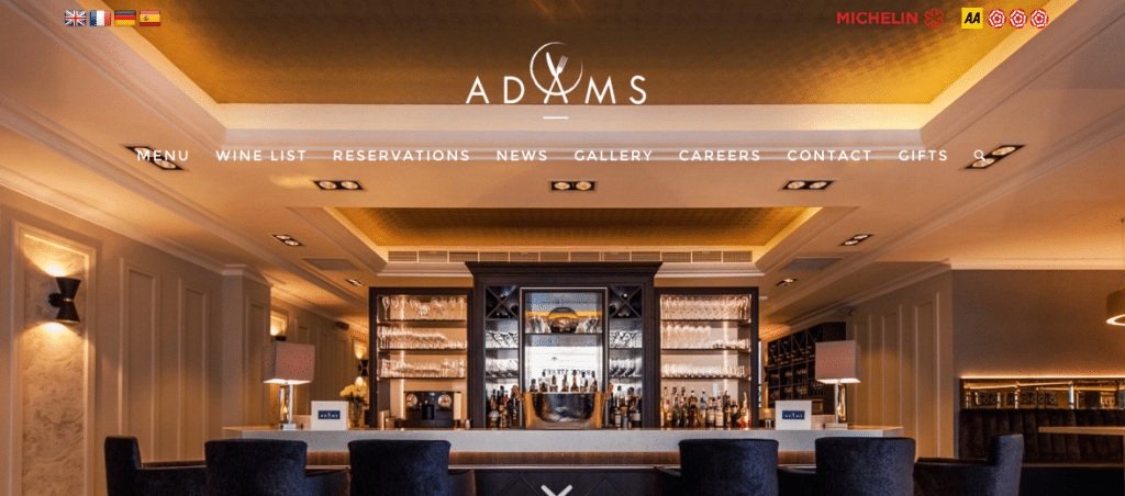
2) The New Visual Identity
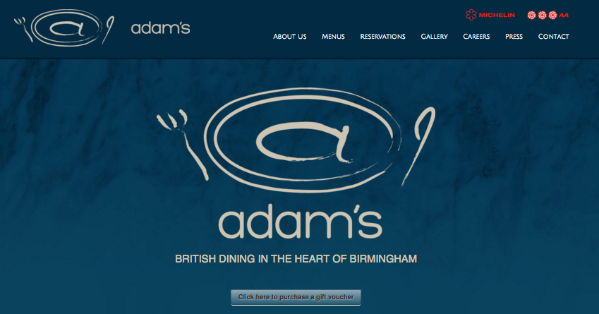
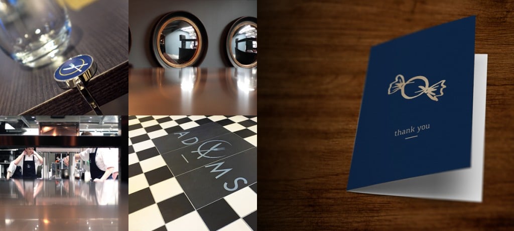
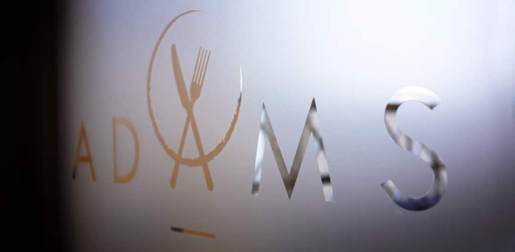
IE redesigned the logo, which now definitely represents the upscale image of the restaurant. The agency chose to keep the same grey/blue and white colors, to ensure that customers recognize the brand. They refreshed the font which now gives a modern touch to the logo.
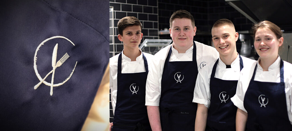
Finally, the cutlery symbol was kept although it was redesigned in a more sophisticated way, with the use of metallic ‘gilver’ (a color between silver and gold) to highlight the plate and cutlery.
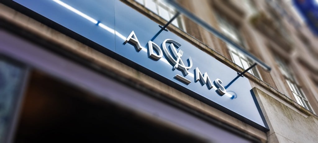
What I really like is how the designers used the fork and knife to draw an “A”. It looks elegant, creative, and can be used as the clear symbol to identify the brand across different communication materials.
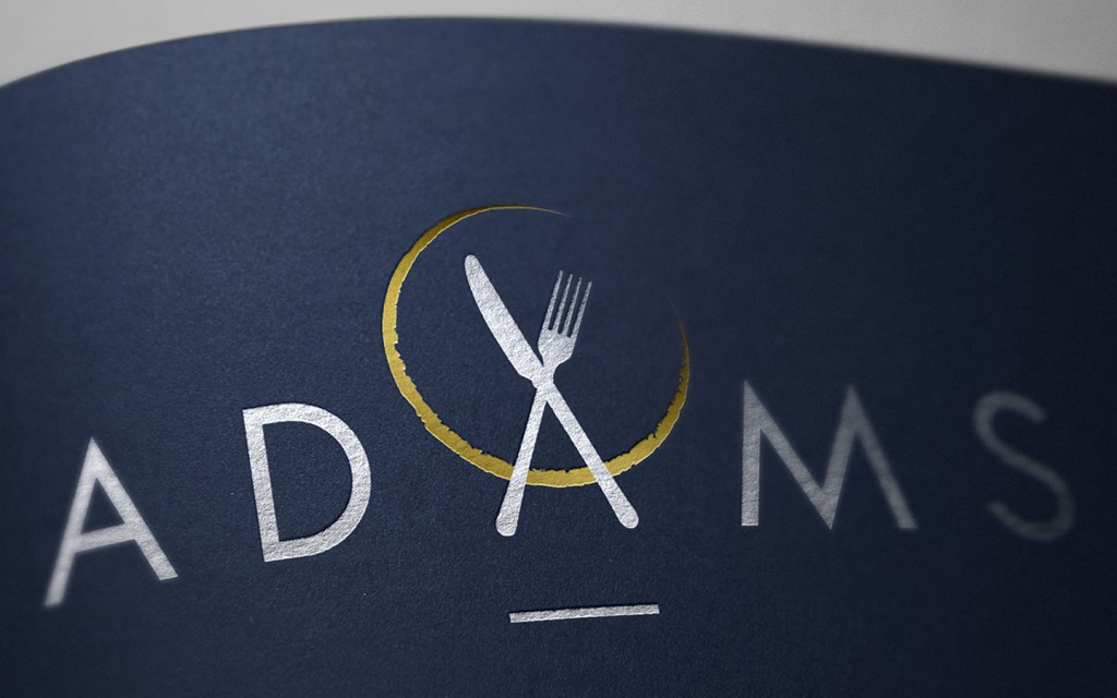
The agency also provided brand assets for Adam’s to apply across the restaurant signage, menus, and uniforms – consistent with the new website and marketing materials. It inspires proud ownership from staff and communicates an upscale global brand in a city with a thriving food scene.
To finish, photography brings the dining experience to life, and – just as in the restaurant – the star of the show is always the food.
Adam and Natasha Stokes of Adam’s Restaurant mentioned, “As an ambitious Michelin-starred restaurant with a growing international reputation, Adam’s chooses creative partners with the utmost care. We cannot thank IE enough for setting their designers loose on the evolution of the Adam’s brand. From the creation of an insightful brief right through to the design of our beautiful new website, we’ve been surprised and delighted again and again.”
3) The Results:
It is too soon to measure the real impact of the new visual identity yet, however since the launch of the new permanent restaurant, the team achieved the following goals:
- 100% of available tables booked 3 months in advance
- 2,500+ unique website visitors on a single day following the opening of the new restaurant
- 65,000 unique website visitors in the first month after launch
IE Design Consultancy is an award-winning agency specializing in working with values driven clients for the past 21 years. IE’s clients include Centro, University of Warwick, Goldman Sachs, Round Table, WRAP and the NHS. The team of 26 people is based in Birmingham’s creative heart in the Jewellery Quarter at Aquinas House, 63 Warstone Lane, B18 6NG, with a satellite studio in Brighton