Airbnb unveiled a major redesign last week to market itself as a warmer and fuzzier corporation that seeks to make people feel like they can “belong” anywhere in the world. From a new logo to a redefined positioning and a new visual identity, this brand transformation is big, and so, I would like to take the opportunity to analyze it with you today.
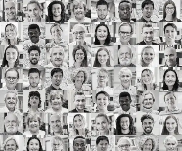
Founded in August 2008 and based in San Francisco, California, Airbnb is an online community for people to list, discover, and book unique accommodations around the world, in more than 34,000 cities and 190 countries. Users must register and create a personal online profile before using the service. This allows users to connect with each other, and post recommendations and reviews.
Proven Systems for Business Owners, Marketers, and Agencies → Our mini-course helps you audit and refine an existing brand in 15 days, just 15 minutes a day.
→ The Ultimate Brand Building System is your step-by-step blueprint to building and scaling powerful brands from scratch.
Table of Contents
1) The brand identity: Airbnb, “Belong Anywhere”
The company began to realize that the Airbnb community had greatly increased in size since its foundation and was now outgrowing the original Airbnb brand. Managing directors of the company needed to rework the brand as it was evolving, and asked themselves: “What is our mission? What is the big idea that truly defines Airbnb?”
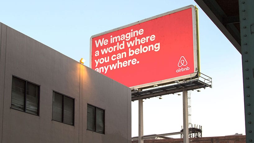
“It turns out the answer was right in front of us. For so long, people thought Airbnb was about renting houses. But really, we’re about home. You see, a house is just a space, but a home is where you belong”, explained Airbnb CEO Brian Chesky. “And what makes this global community so special is that for the very first time, you can belong anywhere”
2) The challenge: To better capture the idea of “belonging”
“Belonging is the idea that defines Airbnb, but the way we’ve represented Airbnb to the world until now hasn’t fully captured this”, stated Brian Chesky.
Having never actively sat down to design an overall brand beyond a series of logos, Airbnb’s founders recognized the importance of this to be able to push the company forward to the next level.
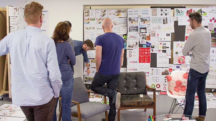
They, therefore, asked global brand and design agency DesignStudio to rebrand Airbnb towards the idea of “belonging”. Together, they designed a refreshed brand identity and developed a new brand strategy for the company.
3) The rebranding strategy
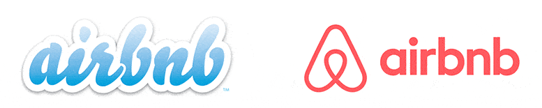
New logo
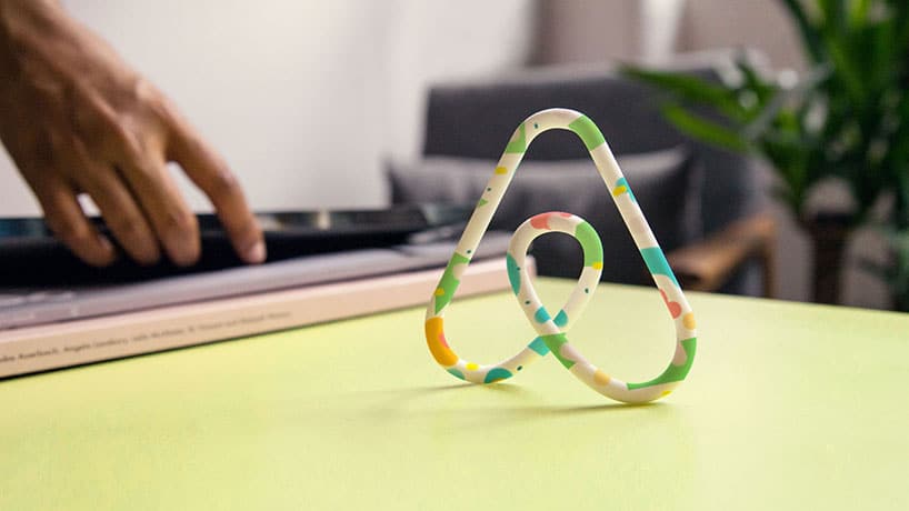
The “Bélo”
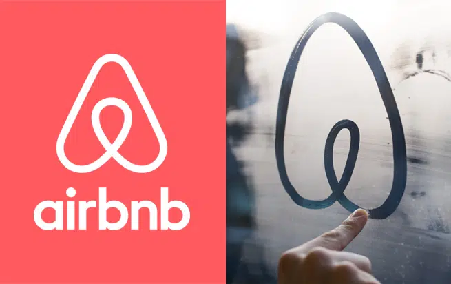
The major change in Airbnb’s transformation is a new symbol the company named the “Bélo”. The Bélo takes the form of an upside-down heart or a paper clip symbol, which also looks like the letter “A”. It was designed to represent four things: people, place, love, and the “a” of Airbnb.
“Belonging has always been a fundamental driver of humankind. So to represent that feeling, we’ve created a symbol for us as a community,” Airbnb CEO Brian Chesky wrote in a blog post. “It’s an iconic mark for our windows, our doors, and our shared values. It’s a symbol that, like us, can belong wherever it happens to be.”
DesignStudio explained the concept was inspired by German designer Kurt Wiedeman’s theory that a great logo “is ‘something you can draw in the sand with your toe’”.
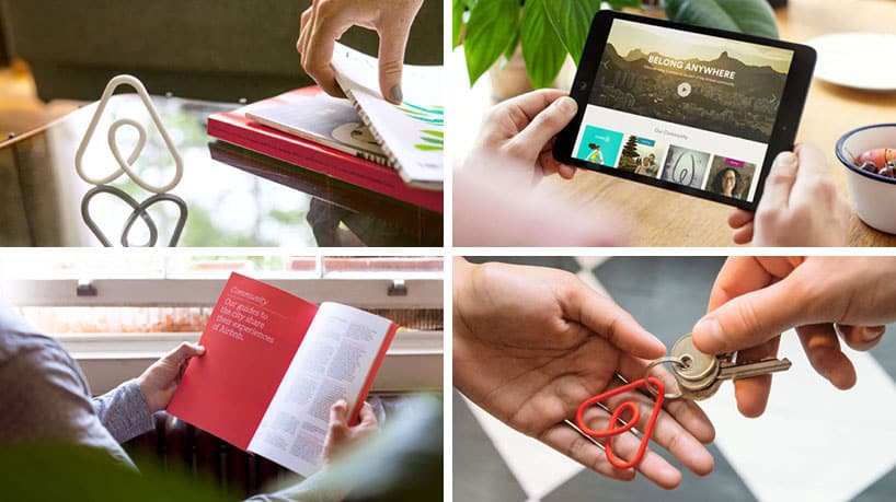
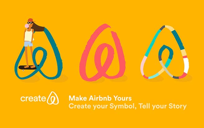
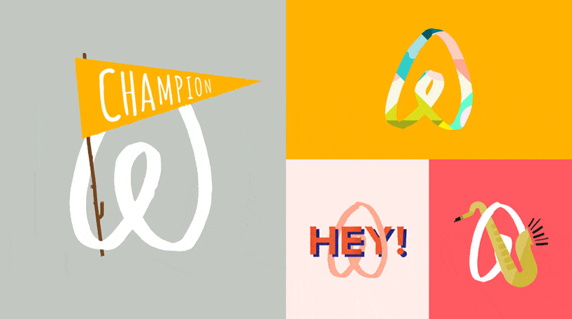
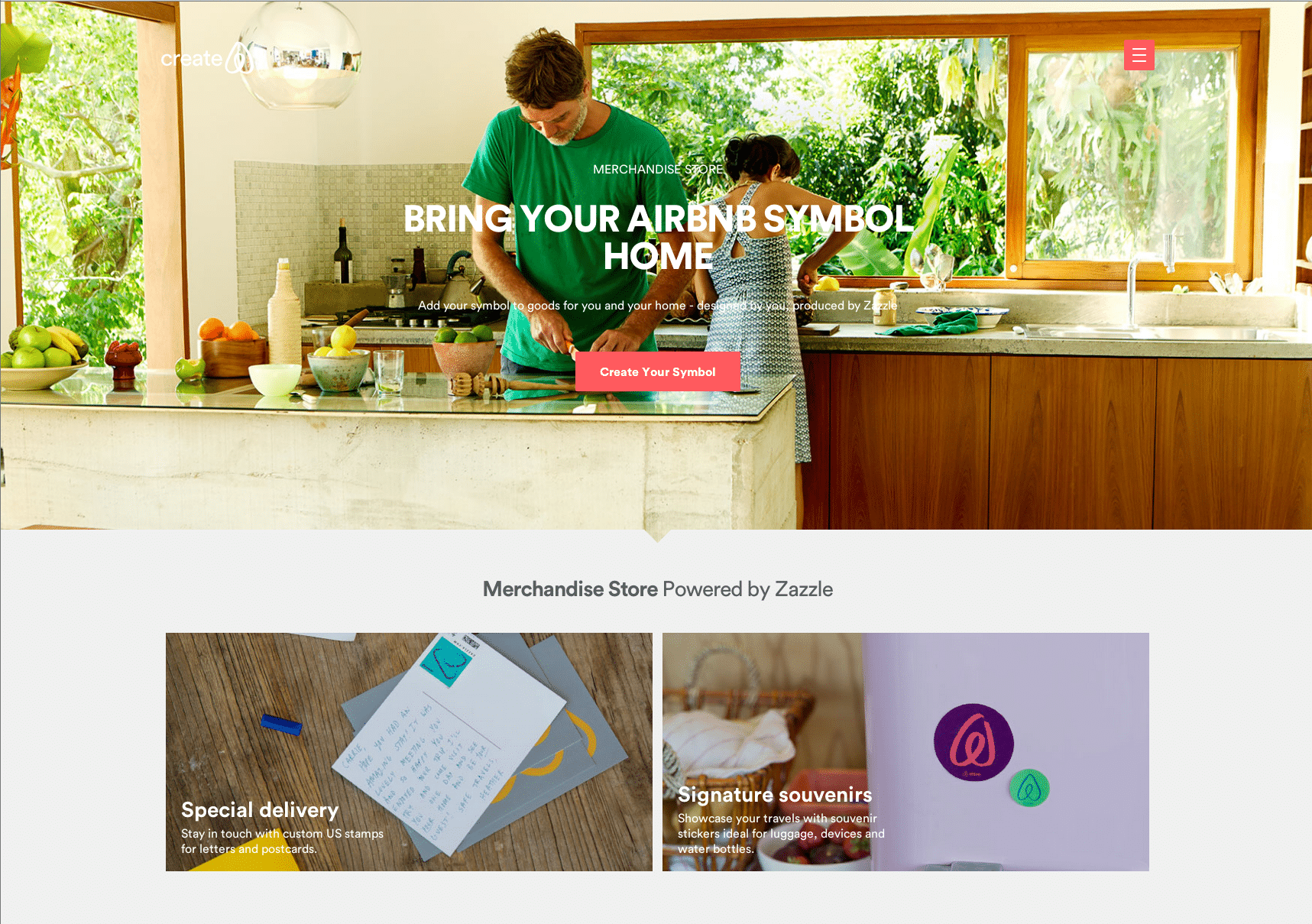
Customer interaction: Create your own “Bélo”
But what is particularly interesting about this new symbol and logo, is that Airbnb developed a section of their site, Create Airbnb” where hosts can personalize the symbol and “bring it home”, on thank you cards, mugs, t-shirts, and other objects.
“Create Airbnb is a recognition that our identity simply cannot be separated from all of you. This is a shared brand identity. It’s something no company has ever done before”, explains the co-founder of the company.
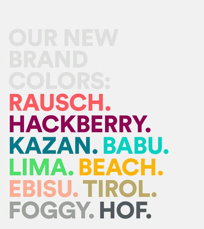
New Colors
Airbnb dropped the dreamy blue and white colors for a color that reflected the passion, emotions, and love, but without the aggression of a pure red. The light red color chosen to represent the brand’s values is supported by a secondary palette featuring bold shades of purple and teal, named after and inspired by streets in cities around the world.
New font
Airbnb chose a custom version of the font ‘circular‘, which is used for the logo and across all print and digital communication supports.
New visual guidelines
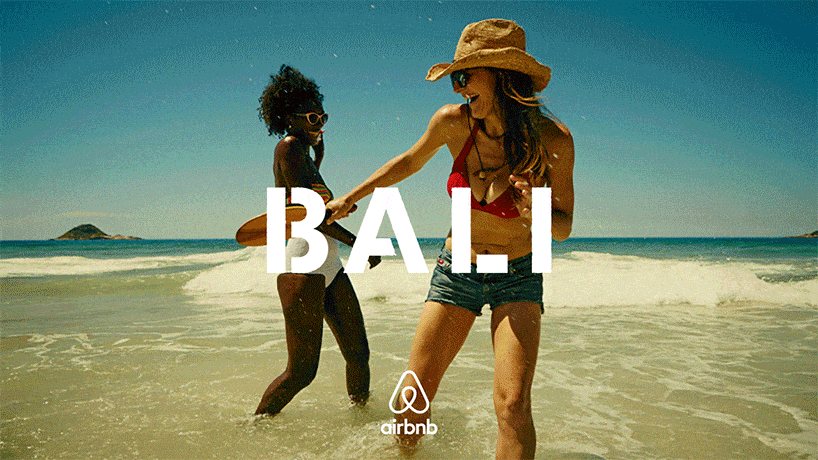
DesignStudio directed a brand film and worked with Airbnb’s art director to create photography and illustration guidelines and an image library.
New Website, IOS, and Android apps experience
Because a symbol is not enough to bring a new identity to life, Design Studio redesigned the entire Airbnb website and mobile apps to better reflect the people who make up the Airbnb community.
To better reflect Airbnb’s new look and feel, the new online interface features immersive photography, bold colors, and clearer listing information.
The company also added a “discover” section, which takes the form of a photo mosaic of locations and accommodations, designed to inspire users by showing them potential travel destinations.
4) Controversy
Airbnb describes their new symbol as representing people, places, love, and Airbnb. The Internet, however, was quick to point out a number of other things the “bélo” seems to represent, from a vagina to a copy of other companies’ logos.
The sexual interpretations of the logo had been reassembled into a Tumblr blog within 24 hours of the new brand unveiling: https://airbnblogos.tumblr.com/. Sexual jokes have already been shared across social media, and could soon affect the brand in a negative way.
Other internet users have also pointed out that the “Bélo” is extremely similar to the logo of software developer Automation Anywhere. However, the two brands have since agreed that Airbnb will not change its rebrand:
Deezen reported “In early 2014 both Airbnb and Automation Anywhere began use of new logos that, by coincidence, have similar designs. Airbnb and Automation Anywhere are working cooperatively to address this issue, and Automation Anywhere is in the process of transitioning to a new logo design that is not similar to the Airbnb logo.”
More users have also suggested that the logo resembles the symbol used by furniture brand Habitat and Japanese restaurant Sushi Shop.
Conclusion
Overall, I really like Airbnb’s effort to reimagine its brand and root it in the people rather than in the technology as it used to be before. Airbnb is making the move from being a technological brand to a lifestyle brand and this has the potential to really push the company forward to the next level.
The fact that the “Bélo” symbol was imagined according to the ideas of people, place, love, and the brand is very clever and illustrates the thought DesignStudio put into creating a meaningful brand with well-defined values.
It is a shame that people see sexual representations within this symbol and are actively damaging the brand by publicly deriding it, especially since the brand put an effort into spreading a positive message through this new symbol.
However, Airbnb says that it is happy for people to do what they like with the symbol, and it could be seen that allowing people to create and share their own versions is a great way to generate some added publicity for the rebrand.
In my opinion, the most dangerous part of the controversy is that the “Bélo” looks very similar to Automation Anywhere’s symbol. However, since Automation Anywhere has agreed to change its logo this is great news for Airbnb who will be able to preserve its newly designed logo for the future.
I also like the concept of inviting consumers to personalize the Airbnb logo. By involving them in the process of creating the brand, Airbnb understood that everyone can be part of the adventure and that this is an interactive journey. This application is a fun way to illustrate the sense of “community”, and by offering the possibility to create personalized Airbnb merchandising, the company extends the branding into people’s homes and generates free visibility, which is very clever!
Finally, I believe both Airbnb and DesignStudio put a big effort into creating a consistent brand over the communication channels. I also really like how they have improved the website’s user interface, as it is now much more user-friendly and easy to navigate, and, most importantly, much easier to find the right accommodation for the right need.
Now it is important that the company actively focuses on delivering its new brand promise of creating a community to which consumers can feel they belong. When a brand fails to keep the brand promise, consumers often become confused and dissatisfied. To avoid this possibility, Airbnb should develop further services where consumers and even employees can meet, interact, and share their Airbnb experiences and stories.
Proven Systems for Business Owners, Marketers, and Agencies → Our mini-course helps you audit and refine an existing brand in 15 days, just 15 minutes a day.
→ The Ultimate Brand Building System is your step-by-step blueprint to building and scaling powerful brands from scratch.
Marion is the founder of The Branding Journal. Holding a B.Sc. in International Business and an M.Sc. in Marketing, her career has included coordinating marketing campaigns for major brands such as L'Oréal Paris, Nestlé, and Mastercard. She has also led strategic partnerships and fundraising for the International Federation of the Red Cross in the Americas.
1 comment
Hi Marion, I am currently working on a dissertation of Airbnb and hospitality industry and therefore sincerely asking you if it is possible to cite from you on this article about Airbnb introduction. If it is fine with you, how should I cite? Wenhui


Hi Marion, I am currently working on a dissertation of Airbnb and hospitality industry and therefore sincerely asking you if it is possible to cite from you on this article about Airbnb introduction. If it is fine with you, how should I cite? Wenhui