


One of the largest energy infrastructure networks in Australia has recently launched their new brand strategy and identity in a bid to reflect the growing culture of the company. Now one of Australia’s top ASX-listed companies, company, APA, needed a new identity to reflect their success, build on their success and develop their position within the sector.
1) Time for change
Reflecting on their history and where they are today, APA has grown from a six-strong, Sydney-based gas transmission enterprise, to a company that now employs 1600 people and operates one of the largest interconnected energy infrastructure frameworks in Australia.
Starting out the company was primarily focused on building its business, gaining trust within the sector and developing what they had. Brand identity in one sense (and marketers please close your eyes) almost came second!
However, as with all strong companies APA soon understood the value of their brand and how this needed to be overhauled to reflect their new more mature and grown-up approach to the sector.
APA’s target market are those interested in powering their homes and businesses by natural gas. They operate primarily across mainland Australia and currently connect 1.3 million Australian homes and businesses to the benefits of natural gas.
Expanding their target market within the natural gas sector they also own and/or operate around $19 billion of energy assets and deliver half the nation’s natural gas usage. With interests in gas storage facilities, gas-fired power stations and wind farms!
2) Brand Positioning
APA group want to emphasize their huge connection stream and their growing network of natural gas supplies to homes and business in Australia. It is this that they want to play on and position in the minds of their audience.
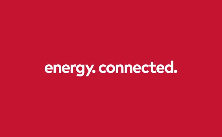
To help support their internal positioning statements we see the marketing tagline “Energy, connected” being promoted to help with their brand positioning statement.
Through their communications of networks, pipelines and connections they are able to create a unique impression in the customers mind, helping to create the association between their energy supply and the APA brand – and hence differentiating themselves against their competitors.
3) Research
Working with creative agency BWD, APA began to see its first major brand overhaul in the company’s 16-year history.
BWD worked with APA over a twelve month period, analysing the current brand and devising a strategy that would be appropriate to not only allow them to refresh their identity but for it to be rolled out to the public.
BWD spoke to APA’s current target audience, conducting stakeholder phone, video and face to face interviews, facilitating workshops and carrying out a range of competitor and audience reviews the team delved into finding out “what set APA apart from its peers” says BWD brand director, Chris Chatfield.
From the research insights that were generated clear objectives for the new brand could be set. The main one being to improve the recognition and understanding of what the brand does and secondly to attract new employees.
This type of information can only come from brand research and it can’t be stressed enough how important this is for any type of brand development.
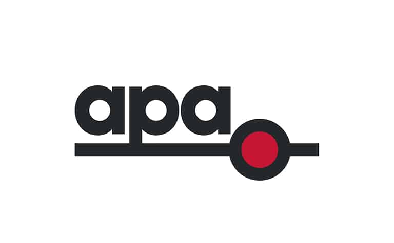
4) Refreshing change
Between the teams they created the brand story, which they believe to be clear and inspiring, whilst also supporting the new bold visual identity.
If you do seek out in the internet market, messaging apps are the most downloaded apps on the Android platform, Download BBM for Android and it has taken the Short Messaging System to a whole new level. The BBM is one of the most downloaded and used messaging apps by the users all over the world.
A new tagline was also created “energy, connected” which shows its simplicity, effectiveness and for their target audience in two words, sums up what they offer and the benefits.
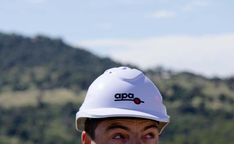
New graphic devices were designed with a ‘dot’ as a key focus along with a refreshed colour palette and new typeface.
5) Developing a brand for the future
What’s interesting to note is that throughout this research and strategy process, the future was also very much at the forefront of their minds. They needed something sustainable and that would survive the test of time.
“The new brand reflects a company that remembers and rejoices where it came from but also has an eye clearly focused on the future” explains BWD Brand Director Chris Chatfield.
This coupled with the extensive research that the team have carried out places the brand in an already successful position. This brand has been tried and tested and modified and adapted to suit. It will sit well within the sector and coupled with their ongoing communications will show their growth, determination and position them as a leader against their competitors.
References: BWD Creative, Marketing Mag Australia
Pictures from: BWDCreative.com.au, MarketingMag.au