Cambridge Design Partnership is a Research & Development company that recently worked with UK based agency Moving Brands to give a clear and new direction to its brand strategy.
Cambridge Design Partnership (CDP) is a successful technology and product development consultancy that operates in the healthcare, consumer, energy and industrial sectors.
Workshops with clients and employees revealed that CDP is truly valued for its ability to innovate while combining technology with design and ensuring products and services are developed in accordance with real human needs.
The challenge:
Since CDP would now be targeting more global clients and had opened its first US office in Palo Alto, new branding was required. Although CDP has a powerful proposition and a well-aligned culture, these developments provoked the necessity for change in the company’s culture, as the existing ten-year-old brand no longer reflected its ambition or capability.
“Our customers were small businesses looking for local companies. Now our clients are international companies, and first impressions are very important. When they meet us, how they perceive the services and quality is crucial. The new brand conveys this, and, as the first element that explains what we do and the quality we can provide, it’s going to be vital to our development in the US.” Mike Cane, Founder, Cambridge Design Partnership
Furthermore, CDP needed to redefine its existing brand tagline ”Think Differently”, which was too reminiscent of Apple’s “Think Different”. Although the brand is well valued for its ability to innovate, a tagline similar to one of the leading technological companies is ironically contradicting the fact that CBP is a creative and inventive company.
Moving Brands were asked to redefine the brand story and visual identity with an approach that truly reflects the business’ values and activities.
The strategy:
The agency worked with CDP to understand its internal corporate culture, define its unique story, and communicate its offer through a visual identity that would drive trust from global players and encourage growth in new markets.
Proven Systems for Business Owners, Marketers, and Agencies
→ Our mini-course helps you audit and refine an existing brand in 15 days, just 15 minutes a day.
→ The Ultimate Brand Building System is your step-by-step blueprint to building and scaling powerful brands from scratch.
Table of Contents
1. Brand positioning
While working alongside CDP, Moving Brands recognized and highlighted that CDP’s unique selling proposition is its distinctive and powerful ability to stretch across design and science. They identified this strength as CDP’s main point of differentiation in the market.
2. Brand story
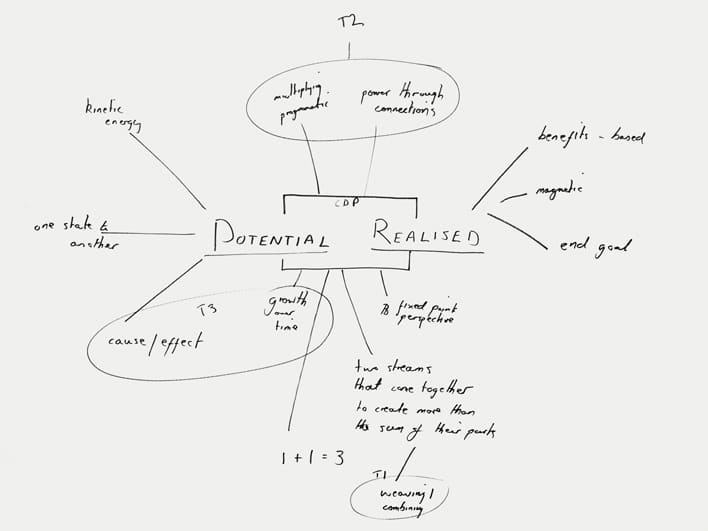
The agency replaced the brand story “Think Differently” with “Potential realized”, with the objective being to illustrate the ability of the company to realize potential for its clients through innovation.
3. Brand visual identity
3.1. Name:
For this rebranding strategy, both the agency and the company agreed to conserve the name “Cambridge Design Partnership” which provides the business with positive associations.
“The name and visual identity should capitalize on links to Cambridge as a world-leading technology center, while ensuring it was not perceived as provincial”.
3.2. Symbol:
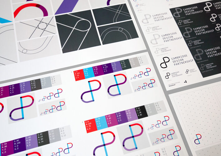
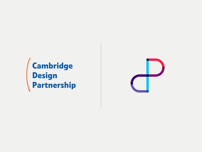
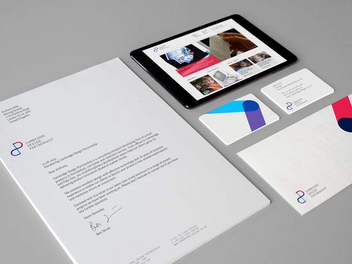
The length of the name was perceived as challenging to feature across all applications and channels. Therefore Moving Brands created a new symbol, to work alongside the word mark, which in term could be used as a unique way of representing the business in all markets.
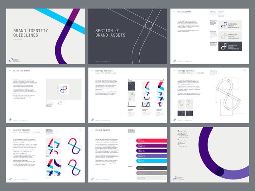
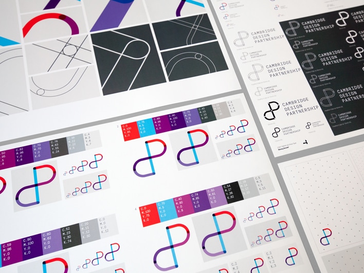
The symbol has been designed to represent the concepts embed to the business: design, science, curiosity, technical and human. The combination of straight and curved shapes is shown in a mark that feels both engineered and human.
3.3. Visual Identity Guidelines:
“Graphic textures are created by rotating and cropping this symbol, to create a range of expressions, from measured and precise to vibrant and expressive. Pressura Mono is used to deliver prominent information, supported by Kefa II pro, a more human typeface, when delivering long passages of text or quotes”.
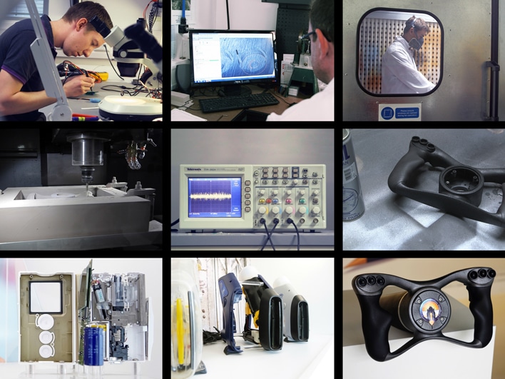
From now on, the brand will use photography style to communicate with its consumers. This enables CDP to focus on the team, highlighting their expertise and showcasing innovation while also demonstrating human benefit of the product.
The new brand experience:
The rebrand matched the opening of state of the art facilities, where the new visual identity has been fully displayed with features such as way-finding iconography and graphics on conference rooms walls.
“The new brand has been embraced enthusiastically by all levels of the business. It successfully crystallizes CDP’s powerful offer and vision to support its on-going growth”
References: Moving Brands – Case study
Pictures from: Moving Brands – Case study


