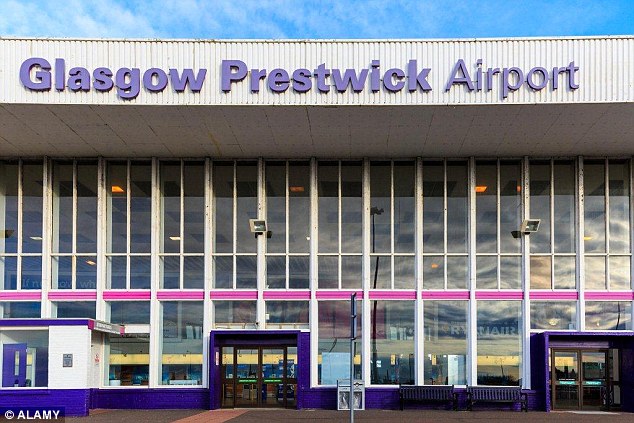
As Scotland’s 4th busiest airport and Glasgow’s second busiest, in terms of passenger traffic, Glasgow Prestwick Airport aims to re-define itself as a lucrative transit hub, in a bid to attract big ticket investors.
In the month of March, 2016, the airport has unveiled an all new visual identity as part of its makeover transition. How does the new visual branding help its cause? Read on.
The objective of the new visual identity
Dubbed as Britain’s only “fog-free” airport, Glasgow Prestwick Airport serves as the base for major low cost carrier RyanAir and around 900,000 passengers have passed through its gates in 2014.
Recent years under private ownership weren’t so colourful for the ailing airport, until the Scottish government took over and nationalised it in 2013. Since then, the airport’s been on a makeover spree – from upgraded departure lounges to extended runways and expanded car parks. March of 2016 saw the unveiling of an all new identity aimed at attracting more investors and European carriers.
The recent unveil, the management believe, would enable Glasgow Prestwick Airport rub shoulders with Britain’s biggest and busiest.
Old and New Visual Identity
The old logo (used since 2005) was getting long in the tooth and understandably so, wasn’t relaying the image of a contemporary Scotland to the flying public. Stuart Wilson from Daily Record and Sunday Mail writes, “The Scottish government has signed off on a rebrand of the business, which they hope will attract new clients to Ayrshire. Gone will be the gaudy purple which has adorned terminal walls for a decade under previous owners Infratil. And in its place will go a crisp and clean new look which bosses are preparing to unleash on the aviation market.”
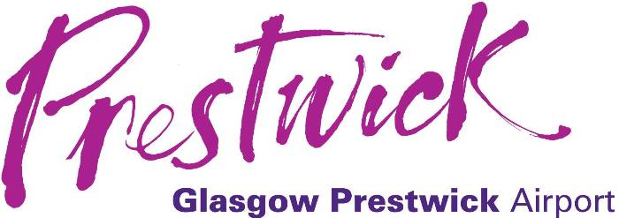
A generous dose of purple can be seen on the old logo and visually purple is a tricky colour. Reddish purple can convey warmth and vibrancy while bluish purple, calm and cool. Both shade combinations have been used in this logo.
The downside of an all purple logo is its inability to appear purposeful; instead, it carries a playful aura around it – not something that’s welcome in the aviation market. Mr. Jenner, the airport’s chief executive adds in the Daily Record and Sunday Mail, “The feedback that we have had is that our current brand did not work well for all these audiences – we need something more corporate, professional and something that will complement customers’ brands.”
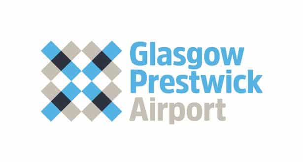
While speaking to Design Week (designweek.co.uk), Mr. Gilmour shares, “At a corporate level the identity’s function is to again show connectivity as well as the logistics involved in running the airport, the movement of freight, facilities offered and the business of flying.”

An interesting blend of monochromatic black-grey shading with mild sky blue squares complete the symmetric pattern. The grey and blue are carried over to the fonts as well. Iterations of this logo will be used thematically around the departure and arrival lounges and suitably adapted for social media and print material.
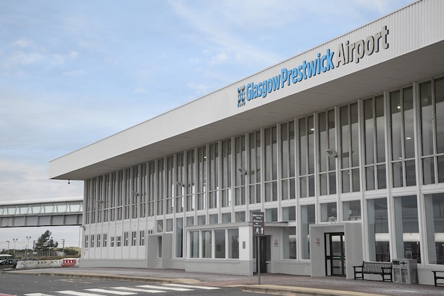
Mr. Jenner proudly adds, “I would be proud to hand over a business card with this new brand on it – it gives more gravitas to the airport than our previous look and feel.”
The design team are hard at work, as we speak, rolling out the new look around the airport and this transition is expected to continue for the next couple of weeks. In the meantime, it’d be interesting to hear your take on this new look. Personally, I like the designer’s no-nonsense approach to the logo while still infusing a Scottish feel to it. What do you think?
References: Daily Records, Design Week
Pictures from: Daily Mail, Glasgow Prestiwick, Daily Records, Design week


