

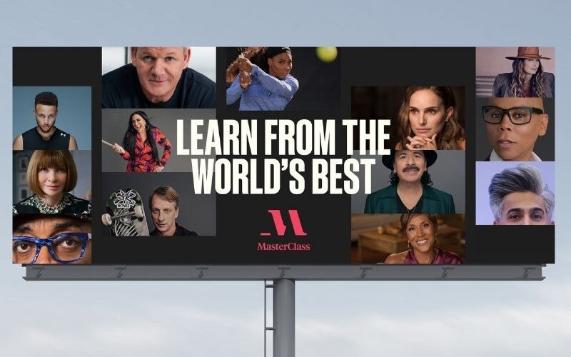
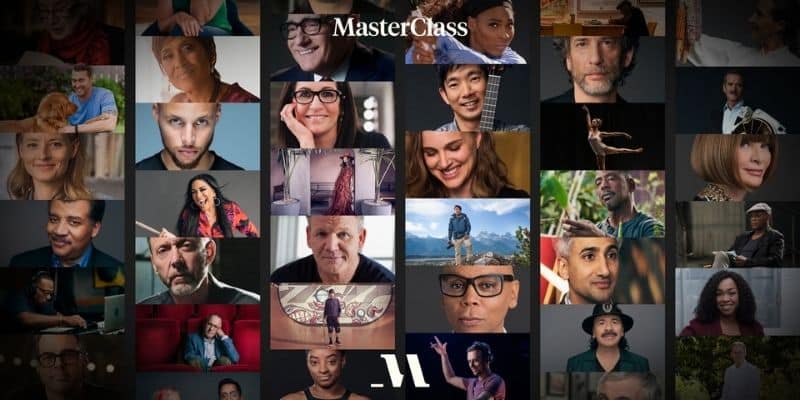
MasterClass is an online platform that offers access to virtual classes with famous experts in several domains. These include Christina Aguilera, Serena Williams, Martin Scorsese, Carlos Santana, Natalie Portman, and many more.
This year, the platform partnered with branding studio Gretel to work on a new visual identity that considers both its famous instructors’ individual brands and MasterClass’ own identity.
Proven Systems for Business Owners, Marketers, and Agencies
→ Our mini-course helps you audit and refine an existing brand in 15 days, just 15 minutes a day.
→ The Ultimate Brand Building System is your step-by-step blueprint to building and scaling powerful brands from scratch.
Table of Contents
The Five Facets of the New Visual Identity
As the company enters its next chapter of growth, MasterClass’ new visual identity, which is now live across all touchpoints, plays with varied serifs and introduces a new range of colors. The agency (Gretel) aimed at creating a brand with a bolder, fresher, and more modern approach.
Presented as a premium brand that brings you closer to a wide range of experts in different fields, MasterClass’ new identity focuses on enhancing the diversity of thoughts and knowledge offered by an expansive and rising range of both courses and subjects.

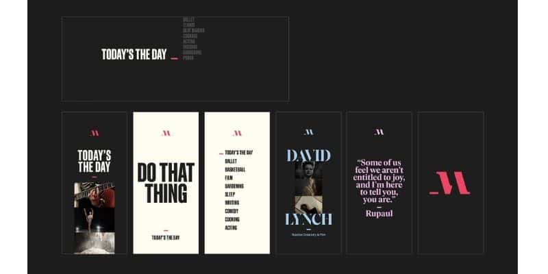
Logo & Personalized Nameplates
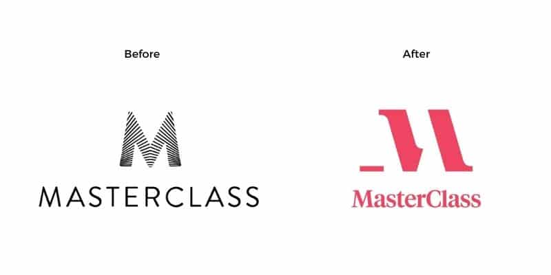
The most notable change in MasterClass’ new brand identity design is probably its new logo, which is an evolution of the original form.
The use of an underscore and the implied edge of each letter forces the mind to fill in the gaps. These intentional gaps in the logo design were chosen to convey critical thinking and learning; two of the brand’s central values.
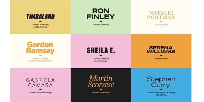
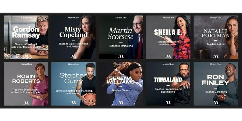
Another highlight of the redesign is that each instructor now counts with their own and unique visual identity. The instructors’ names will be shown in different typographies (nameplates) and personalized color schemes that reflect their personality and class theme, making MasterClass a versatile brand.
Typography
MasterClass’ new logo portrays classic serif typography. This typography differs from the previous one, which was much thinner. The former design of the letter “M” displayed a movement effect that perhaps didn’t provide that elegant touch that the platform needed. The new typography speaks for the MasterClass brand, while a significant collection of secondary fonts represent the instructors and classes, which could be considered as MasterClass’ sub-brands.
Underscore
The underscore is a new fundamental aspect of MasterClass’ visual identity. This simple line is present in both the new logo design and throughout the platform. It represents the blank space that’s up to the user to complete and a new ability to be learned.
According to MasterClass, the underscore is also being used as “a connector, selector, divider and highlighter, reinforcing MasterClass’ logo throughout the user experience across the platform.”
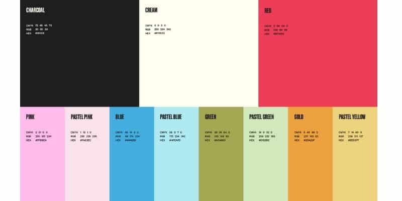
Color Palette
The palette includes vibrant colors as well as pastels:
- Primary colors: Charcoal, Cream, and Red
- Secondary colors: Pink, Pastel Pink, Blue, Pastel Blue, Green, Pastel Green, Gold, and Pastel Yellow — all represent the diversity and range of its instructors and classes
While the primary colors represent MasterClass’ brand as a company, the secondary color palette has been designed to represent each of MasterClass’ instructors in a unique way.

Photography Style
According to the brand, MasterClass’ new photography style is intended to create a sense of intimacy and proximity, “aiming to capture the details of an instructor’s process or craft while also creating a connection with each member.”
The photography style works well with the courses’ production style, which involves high-end cinematographic and photographic techniques, similar to a film production firm.
Conclusion
The new visual identity design for MasterClass makes the brand look even more professional and consistent across the platform.
The idea of creating a distinct visual identity for each instructor, with a unique nameplate, font, and color scheme is very interesting. It allows the company to include their personal styles within the overall MasterClass brand and highlight the business model of MasterClass: “a portfolio of individual classes taught by a diverse set of instructors”.


Great Job on this article! It demonstrates how much creativity, strategy and effort actually goes to produce such unique logo and branding.
I hate their new branding!! Looks like a fuzzy knock off of Marriott’s classic red M… their old one was so much more chic and iconic
Thank you for the great article! I also think it would be worth noting that Future London Academy has a YouTube where they address copywriting, tone of voice and branding with words. If anyone’s interested, here’s the link – https://www.youtube.com/watch?v=JBtnF8NliVg&t=1s
No longer looks iconic, no longer looks professional. So distracting, and just feels like mind programing (propaganda) because it does nothing to help me navigate or learn or anything. All it does is overlay someone’s view of things. I don’t need to be told about diversity of thought, I need the service that I’m paying for. Seriously considering cancelling.