

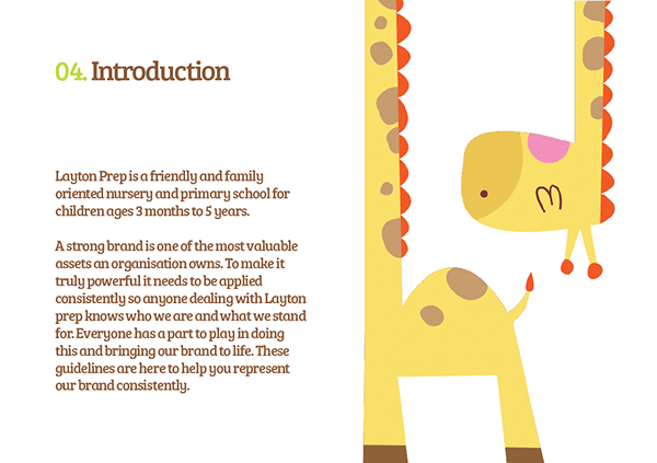
Layton Preparatory School is a friendly and family-oriented preschool for children from 3 months to 2 years old. In 2016, the school was a new player in the competitive nursery/educational sector in Nigeria – and needed a powerful brand strategy and visual identity to enter the market.
The new brand strategy and visual identity were developed by Ellae Creative Design Agency, a creative agency based in Nigeria.
Proven Systems for Business Owners, Marketers, and Agencies
→ Our mini-course helps you audit and refine an existing brand in 15 days, just 15 minutes a day.
→ The Ultimate Brand Building System is your step-by-step blueprint to building and scaling powerful brands from scratch.
Table of Contents
The challenge
The educational sector is very competitive in Lagos, Nigeria. Layton Preparatory School needed to differentiate its offerings while emphasizing its unique positioning in its niche: crèche and pre-school. The school needed a brand strategy that would bring their brand to life, but also make it appealing to both parents and small children.
The Ellae Creative team aimed for a distinctive brand positioning that would emphasize its fun, warm and playful brand ethos but also its promise to parents to nurture children’s development through the early formative years. It became important also to develop a unique brand identity that would differentiate the school from its competitors.

The brand strategy and visual identity
The first step in the development of this new brand strategy was to define the school’s target audience, objectives, and concerns. The agency then constructed the Layton Preparatory School ‘brand platform’ through the integration of its brand promise, brand value proposition, and shared values.
The brand essence was then extracted from the brand platform and a definitive positioning for the school was articulated. This formed the foundation of all the design and creative routes that were explored and presented.
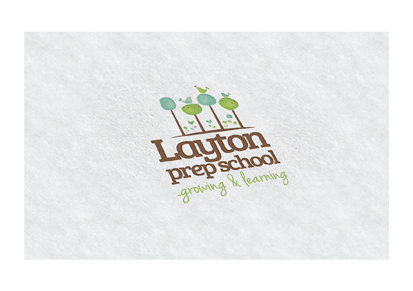
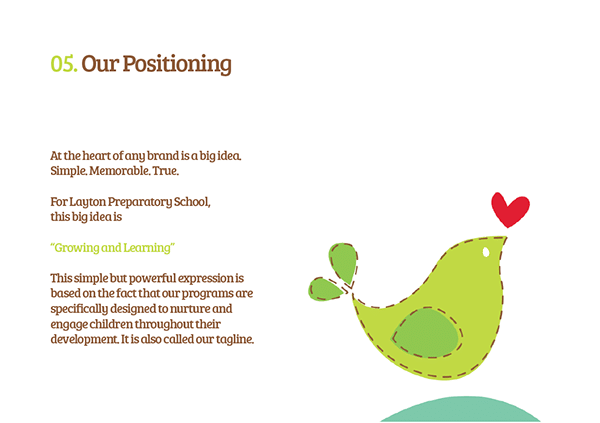
The brand positioning of the school was further captured in its tagline, “Growing and Learning” which was developed based on findings that the school programs were specifically designed to nurture and engage children throughout their development.
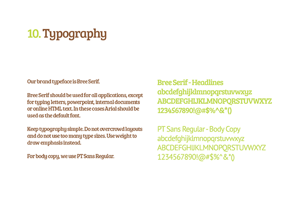
Once these elements were in place, Ellae then ideated and developed visual concepts including a logo, a color palette, custom typography, and brand illustrations that formed the new brand identity and captured the school’s brand essence.
The strategy for the visual identity was to develop a distinctive brand illustration set that would be playful, fun, and evoke feelings of warmth and comfort to young parents and their children.
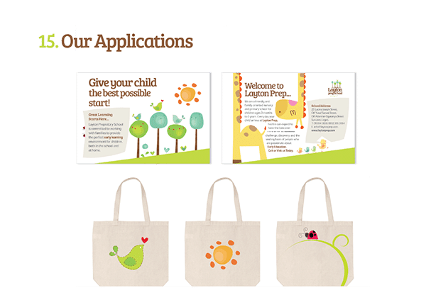
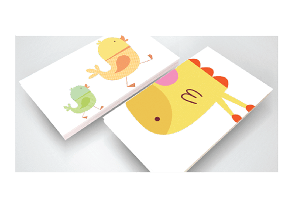
The use of illustrations allowed the team to create a special atmosphere full of life and positive energy through the use of animals, trees, and flower images. The illustrations contributed to the creation of a special connection between the school and its clients (parents and their young kids).
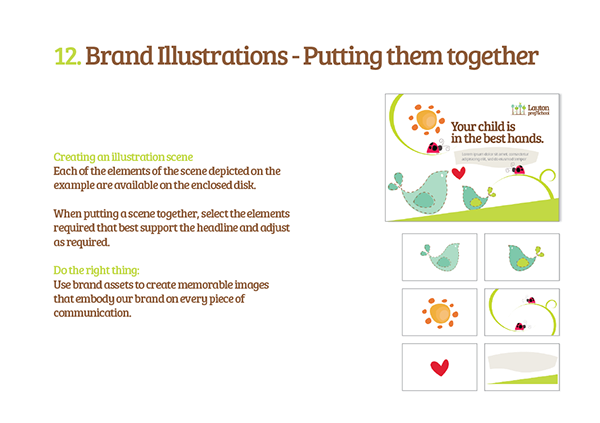
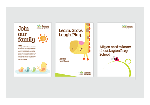
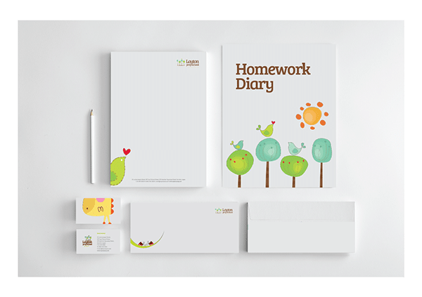
The approved conceptual graphic identity was then refined and extended to include primary and secondary visual language, color palette, typography, layout, etc. These were applied to the different touchpoints of the brand with its customers. They were also extended across all the school’s graphic and digital applications including the school’s stationery, editorial materials, signature style, vehicles, promotional elements, website look, and feel, among others.
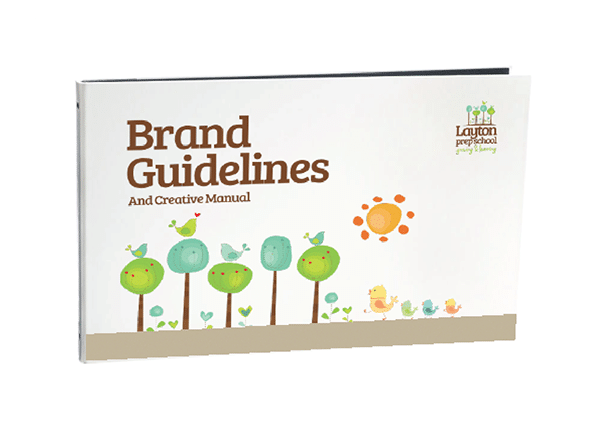
Finally, the agency prepared a brand guideline and implementation control manual in the form of a navigable PDF format, print brochure, and online e-resource (with controlled access).
The results
The work for Layton Preparatory School was a success and received a lot of positive feedback from clients, stakeholders, and from the general public.
After unveiling the new brand identity and applying it across the school’s communication touchpoints, the school had an overwhelming number of admission inquiries for the new academic session.


Hey Marion, that’s a great result right there! This shows the importance of using an accurate branding strategy for each institution/brand/business. The combination of a good color pallet, well designed and family-friendly logo and the other elements that you mentioned make this strategy work. Thanks for sharing this, keep the good work!