


Back in 2011, a new brand identity was born for the country Peru in South America. The process of creating the brand started in 2009 and was led by PromPeru (Peru Exports and Tourism Promotion Commission) and designed by the Buenos Aires office of Futurebrand.
I believe this case study is very interesting, as we usually talk about branding strategies for consumer goods and service companies. But anything can need a branding strategy, from a human being (which is called personal branding) to an entire country!
Branding a country can help attract tourists and investors, and increase the demand for what the product has to offer (for example, product and services). Also, good branding can help the country earn the respect of other nations.
Proven Systems for Business Owners, Marketers, and Agencies
→ Our mini-course helps you audit and refine an existing brand in 15 days, just 15 minutes a day.
→ The Ultimate Brand Building System is your step-by-step blueprint to building and scaling powerful brands from scratch.
Table of Contents
The Challenge
The country needed a strong and positive country brand that stood out, drew attention, and was able to transmit a clear promise.
The objective was to create acompetitive advantage for the country to gain international exposure (such as tourism and exports), but also to attract investors.
The Brand Strategy
The new brand identity was built around Peru’s flavors, colors and living history.
It was built to attract more tourists to both the new and the modern Peru, mirroring all its beauty, diversity and generosity.
“Peru is now an international destination that offers attractions and opportunities that are unique in the world, due to its natural and cultural treasures.”, explains branding agency Futurebrand on its website.
Watch the video here:
Brand identity
The brand needed to be used within a variety of sectors (tourism, gastronomy, investments…), which is why the agency decided to keep the brand’s name simple. The entire identity was built around the word “Peru” and no frills were added to the name.
Shape
“The spiral shape of the capital letter “P” takes its inspiration from one of the graphic motifs found throughout all the ancient cultures that flourished in our land, and it represents evolution, change, and transformation. It also evokes a fingerprint, in line with the concept that “There is Peru for everyone”, explains the official website of the country.”
The color red
The red color chosen for the logo is a reflection of the intense and vibrant red on Peru’s flag, which represents the dynamic culture and people of the country.
Because the country possesses different facets and aspects, the brand identity design could not just rely on the color red, and was also built upon a multi-colored palette. The colors symbolize the diversity of Peru’s regions and landscapes, and its energetic and stimulating character.
![]()
![]()

The design
![]()
![]()
![]()
![]()
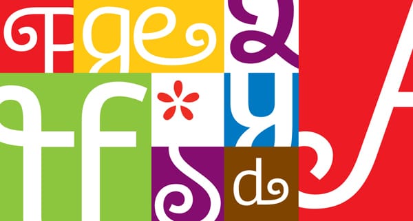
The graphic design line was inspired by the different regions and cultures.
The photographs chosen to promote the country are traditional images of Peru, but also include the addition of flowing lines which follow along the contours of key elements in the photographs. This design connects the images to the overall look of the campaign, and also sets the photographs apart from simple stock images, which are often chosen for destination brands.
The Results
“The marque for brand Peru is now a globally recognized symbol and captures the wide and varying elements of Peru’s heritage, history and culture. The design work for the identity system was given a D&AD ‘in book’ award for 2012.”
Peru now has a very memorable brand that tells the world how culturally rich the country is. We like that the branding strategy shows a true connection between the brand and the country.
References: Underconsideration, Peru’s official website, FutureBrand, Creative Roots
Pictures from: Underconsideration