


Proven Systems for Business Owners, Marketers, and Agencies
→ Our mini-course helps you audit and refine an existing brand in 15 days, just 15 minutes a day.
→ The Ultimate Brand Building System is your step-by-step blueprint to building and scaling powerful brands from scratch.
Table of Contents
Introducing Gap
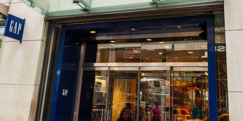
Gap is a well-known, well-established clothing and accessories retailer founded in 1969. It stands as one of the largest global specialty retailers due to its popularity amongst a broad demographic of consumers.
In 2010, following slumped sales after the Financial Crisis of 2008, Gap decided to redesign its 20-year longstanding logo, giving rise to the ‘Gapgate’ phenomenon. This article will look at the unfortunate backfiring of this logo redesign, highlighting the lessons that brands ought to learn from this seemingly unexplained rebranding strategy.
The Gap Logo Change
The Old Gap Logo
Gap’s highly recognizable logo, which represented the brand from 1990 to 2010, is a simple dark blue square featuring the ‘Gap’ name in white serif writing. Typically, a brand will undergo a visual rebranding following a significant change in the company’s strategy, which warrants a visual signal for something new within the organization. Therefore, the almost complete upheaval of the original logo in 2010 proved to be a shock felt (and expressed) amongst both consumer and professional communities.
The New Gap Logo
The old Gap logo disappeared pretty much overnight. It was replaced on October 6, 2010, with a new logo that featured a much smaller dark blue box and the ‘Gap’ name written in bold, black Helvetica font. This new logo was designed by a leading New York based creative agency, Laird and Partners, who holds a solid reputation in the field of branding and communication in the fashion industry. It is estimated to have cost around $100 million. (1)
Gap’s vice president of corporate communications, Bill Chandler, when asked about the change, said, “We believe this is a more contemporary, modern expression. The only nod to the past is that there’s still a blue box, but it looks forward”(2). A spokesperson for Gap added that the new logo was intended to signify Gap’s transition from “classic, American design” to “modern, sexy, and cool.” (3)
Gap seems to have embarked on a mission to modernize and rejuvenate the company, along with its sales figures and stock prices. This urge to modernize has been criticized as a “panic to do something, and quick”, to fix fallen sales (Baekdal, 2010), with figures showing that same-store sales at the time were down 4%, following a 10% decline the year before (4)
A second consensus was that Gap was simply experiencing “brand fatigue” having kept the same logo in place for over 20 years, the redesign a “change-for-change’s sake” (Enderwick, 2014).
How Long did the New Gap Logo Last?
In an embarrassingly quick turnaround, Gap took the decision to revert back to its old 1990 logo after less than one week (on October 12, 2010). The same spokesperson, now backtracking on her original “modern, sexy and cool” comment, stated that “we’ve learned just how much energy there is around our brand, and after much thought, we’ve decided to go back to our iconic blue box logo” (5).
A Logo Redesign Failure
Gap’s speedy return to the old logo signifies a failed rebranding strategy. The new logo received almost immediate negative backlash from both consumers and professionals, who were taken aback by the change, which occurred without any prior build-up. The move neither seemed to accompany any other organizational change, for example, in product offering or senior management.
Immediate Consumer Backlash
Consumers quickly took to social media platforms to express their disdain for the new logo. Some critics hailed the new logo for harkening to the brand’s nature (plain and practical) (Baekdal, 2010), but the reaction was negative for the vast majority.
Within just 24 hours, one online blog had generated 2,000 negative comments, a protesting Twitter account (@GapLogo) gathered 5,000 followers, and a “Make your own Gap logo” site went viral, collating almost 14,000 parody logo redesigns (6).
It is clear that both consumers and branding professionals felt cheated by Gap, who, off their own back, decided to revamp their identity. This visual change which appeared a rather out-of-the-blue act confused and angered the community.
Understanding the Backlash
So why did consumers feel so strongly about the new Gap logo?
Brand Recognition
Consumers use logos as a key signifier of a brand; it’s often the first thing that comes to mind when a person thinks of or hears a brand name. The logo, therefore, largely contributes to building brand salience. Changing your logo at the drop of a hat causes confusion and risks depleting any brand awareness that has been built. Will customers know that you’re the same brand they’ve always known and loved?
Emotional Connections
Brands often underestimate their emotional impact on consumers, particularly their loyal ones. This emotional bond exists because a brand and its reputation (complete with its recognizable name and logo) have the power to offer a consumer a sense of familiarity and safety about the products they purchase.
Put simply, the logo is a visual indicator of trustworthiness and acts almost as a connection point between the brand and the consumer – consumers know what they are getting behind the logo. The same logic applies between humans – familiar and recognizable faces provide us with a greater sense of safety and trust.
How Gap Handled the Logo Backfire
First: A Crowdsourced Redesign Attempt
In response to the backfire, Gap firstly tried to justify the new logo as a deliberate strategy to crowdsource ideas for a fresh logo. On their Facebook profile page, Gap wrote, “Thanks for everyone’s input on the new logo! […] We know this logo created a lot of buzz and we’re thrilled to see passionate debates unfolding! So much so we’re asking you to share your designs. We love our version, but we’d like to see other ideas.”
The new logo could have also passed as a clever PR stunt to increase brand strength through online publicity and word of mouth. This idea seems more credible than the unrealistic crowdsourcing claim, especially given that the designers (Laird and Partners) are trusted in the industry and have dealt with many big brands, including Calvin Klein and Juicy Couture. Surely they knew what they were doing?
Second: A Necessary U-Turn
It seems that Gap agrees that the crowdsource excuse was far-fetched. After just six days, Gap reinstated its original 1990 logo. In response to the move, they stated that much had been learnt in the process – “we are clear that we did not go about this in the right way […] we missed the opportunity to engage with the online community. This wasn’t the right project at the right time for crowd sourcing. There may be a time to evolve our logo, but if and when that time comes, we’ll handle it in a different way” (Marka Hansen, President of Gap in North America at the time).
This acknowledgment of error over both the need to rebrand and how to go about it has highlighted Gap’s lack of understanding of how brand identity should be maintained and developed. It is clear that consumers are at the heart of any strategic move, particularly when financial results rely almost solely on their purchases. If you upset your customers, you upset your profits.
Luckily for Gap, the speed at which the 360-degree U-turn came meant that many people had not even noticed the change before it had disappeared again, saving Gap the humiliation of a further sales slump.
What Can Brands Learn from Gap’s Mistakes?
This case study has revealed that a company’s logo plays a central role in connecting consumers with brands, and therefore in enhancing brand equityBrand equity represents the value of a brand. It is the difference between the value of a branded product and the value of that product without that brand name attached to it. More. Here are four key lessons to learn from Gap’s error in rebranding judgment:
1. Customers Care More Than You Think
As much as we all try not to judge a book by its cover – we all do. The same goes for brands. We often judge a brand based on its logo and aesthetic alone, and Gap has proven that changing your logo can damage the extent to which people are able to recognize and trust you.
Brands must be aware that consumers do not tire of logos as quickly as employees might, for they are exposed to it much less frequently. If you plan to change your logo, it’s a good idea to warn your customers first because they might care more than you think.
2. Your Logo Represents Who You Are
Changing your visual identity has the power to change how consumers perceive you. A logo is often the most efficient way of stating who you are since it is nearly always the first thing (other than the brand name) that consumers come into contact with. Making significant visual changes has the effect of displacing all previously formed brand associations, putting you back at square one in terms of developing your identity.
Rather than eliminating the overall essence of your logo, make small, incremental changes that enable consumers to continue to recognize you in the same way.
3. Make Your Rebranding Strategy Make Sense
As the saying goes, ‘if it ain’t broke, don’t fix it’. Gap at the time of the change showed no indication of faltering brand loyalty or recognition, and although sales had slumped, the logo redesign seemed a little random. A logo refresh is no bad thing, but it must reflect changing organizational realities or a change in brand direction to be successful. Visuals should be the last step in the strategic shift. If your new logo isn’t solving a different problem, you are best to leave it alone because the consequences can be equally as negative as they might be positive.

4. Beware Of Social Media
The internet provides a space for news and opinions to spread like wildfire. Online word of mouth needs to be accounted for and monitored by brands. Adverse reactions can result in a poor reputation for the brand. Negative brand associations can quickly develop and, in turn, can have negative repercussions on your brand equity (and your bottom line).
Conclusion
It is difficult to predict how people will react to a new branding strategy. This case study illustrates the power of a logo to define who you are and to act as a connection point between you and your customers. Making drastic changes to this connection point must be done in line with a wider branding and business strategy. Otherwise, brands risk facing the wrath of consumers whose opinions easily serve to damage their reputation.


Good article. I was never a fan of the old logo. Bit clumsy and old fashioned. I prefer the new one. It looks fresher, sharper but still simple like their products. That’s good but I agree it’s a big shift too far in one go. If they had preempted and teased the audience slowly at first then Less of an impact. Let’s not forget though that some loyal fans of the brand as it stands may jump ship but there are new audiences to be found. So, maybe in time it would level out. Risky but a brand seen to be refreshing itself is no bad thing but, as you rightly say, that needs to be sensitively handled. Thanks for your article. Very informative.
Hi Abigail, nice compilation I still like the old one – it’s classic.
Forgot to mention how the common comment was that it looked cheap and could of been made on MS Paint.
Here we go again. This time it’s Elon futzing around with Twitter trying to rebrand it as X.
Yes indeed! An article about Twitter’s extreme rebrand to X will be published on Monday. We’d love to hear your thoughts about it. Stay tuned :)
The “360-degree U-turn”? 😂