
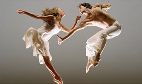
Based in San Francisco, modern dance facility ODC, made the decision that they needed to create a visual identity which captured the “physical motion, human touch, and warmth of the dancers it works with”.
So working with brand consultancy Landor, a complete visual identity system soon got underway.
1) The rationale
ODC, according to their website is a “ground-breaking contemporary arts institution” and one of the most active centers for dance on the West Coast. As well as having a full program, playing a big role within the San Francisco community, holding the status as a nationally regarded presenting venue – they’re also the first modern dance company in America to build their own home facility.
With such a great heritage and also development story, they felt that they needed their visual identity to be strengthened. They needed guidelines and a brand strategy detailing how they could capitalise on their unique and highly regarded position.
A brand visual identity system allows organisations to keep a sense of control throughout all of their communications. As well as showing a sense of pride and credibility.
So why shouldn’t ODC be proud of what they have built? And why shouldn’t they have a strong visual identity to represent them at the highest level.
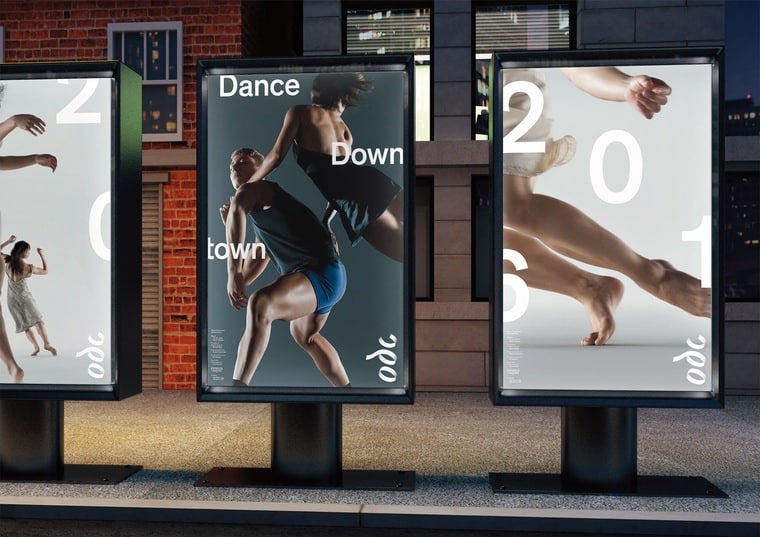
2) The work
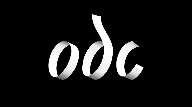
The story behind the development of the creative took inspiration from the ODC dancers themselves. With the identity curving and twisting like a dancer in space. The brand visual is to capture the very essence of ODC. Consultancy Landor believe the new identity to be strong, fluid and unafraid of the subtle imperfections that make it so unique.
ODC: Unifying spirit, voice, and movement from Landor on Vimeo.
Setting them apart and making sure their brand represented their status, the branding strategy had to look at how they could achieve world-class sophistication and approachability. And how they could bring the brand to life.
3) The new visual identity system
The new branding was launched strategically during ODC’s spring performance season. As well as appearing on buses, transit stops and public spaces throughout San Francisco.
In addition, the timing in which the brand was launched allowed them to unveil their new visuals, promote their spring performances and almost show their unveiling with special performances. This was heightened with short video sequences being played before each dance performance helping to further exemplify the core of ODC.
Both organisations have worked together to tie everything in strategically, which when launching a new brand is just as important as the visual itself!
4) The result
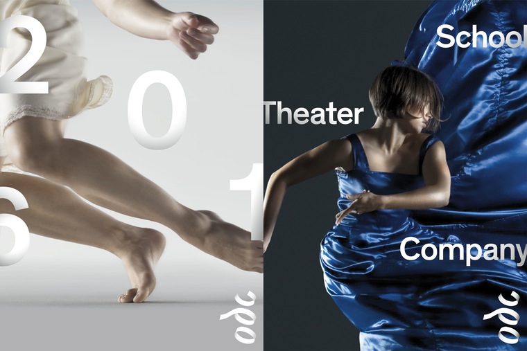
Finally, through dynamic typography and bold imagery it has allowed for a unique and distinct visual style to be created for ODC.
But more than that. The strategy allowed it establish itself and lay down some great branding foundations. Helping to bring three ODC organisations into one. A professional dance company, a community-based school and a performing arts theatre.
Of course good branding and design as well as hard work and strategy does not go unrecognised. And as a consequence Landor’s work for ODC has been awarded the Gold Graphis award for branding in the 2017 Design Annual.
A very stylish and swift design mark, I agree. Completely representing ODC and their dance facility. However, does it fit with the digital era, and is the identity system flexible enough to adapt?
References: ODC Dance, Landor
Pictures from: ODC Dance, Landor