


Due to misconceptions and poor education of the feminine products available, sales of tampons in China account for just one per cent of the £60.7bn feminine care industry.
Consultancy company `PearlFisher` has created a “stylish and discreet” design for new Chinese tampon brand Femme. Helping to educate women about sanitary products and to dispel any myths about the poorly understood product.
1) The Market
The sale of feminine products is big business in the Western world and has been for some years. Yet, it is only now starting to cause ripples and commercial interest in China.
For China this is much more of a non-talked about industry. It is often stigmatised by cultural misconceptions and lack of information available. So it’s of no surprise that recent research shows that only 2% of women in China use tampons. Citing the main reason as being inexperience with the products.
2) A new brand
To tackle this growing concern and to also feed on the growing interest in the area Yoai, the company behind Femme, have launched their new brand and marketing campaign. In a bid to help inject some positivity and freshness into the sector.
Company PearlFisher, were approached to come up with the brand strategy, naming, brand identity and packaging design. Taking on the complete branding, in order to tie everything together. But to also create a brand that would work for the market they were entering. They needed it to create a stir. Breaking down barriers as well as educating enough women that it helped them to achieve their sales targets.

3) The new look
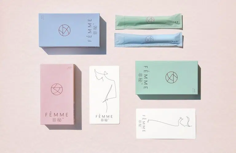
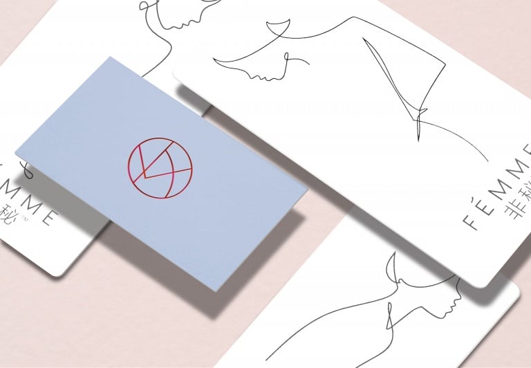
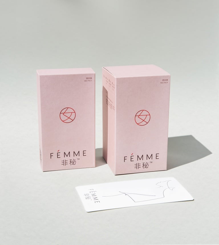
Natalie Chung, Creative Director at PearlFisher commented in The Drum: “The logo- the Chinese character of womanhood contained within a circle and embossed in bold red – places the brand in a modern, chic space whilst retaining an element of cultural significance. The elegant sans-serif word-mark elevates the product from basic pharmacy to high-end premium, with a hit of the circular logo subtly indicating European aspiration as it forms an accent on the “e”.”
Coupled with this the packaging also follows the elegant and stylish route, with embossing and use of a foil logo. As well as card inserts of line-drawn female forms which replicate Chinese characters.
But it is the back of the packaging that is of the utmost importance. Here women can find educational information dispelling cultural misconceptions. The packaging has been used to communicate and teach women how to use tampons correctly.
4) The result
No one can argue with the branding. Elegant, subtle, stylish. Everything that it should be when looking at the market they are entering and the perceptions that are currently there. They’re also providing the educational information on the back of their packaging. They aren’t hiding away, to be lost like many others.
Using Chinese symbols and characters as part of their design strategy helps to draw people in. It serves to feed their curiosity. Above all I do believe that it does what it says it wants to, in that it “empowers women in China”.
Victoria Li at Yoai, commented in Design Week that the new brand identity is “based on a modern interpretation of Chinese values, rather than something “overtly westernised”. It is taking into account the Chinese culture and it has worked this into the brand strategy and overall design to make it a better product.
Providing more choice and a clearer understanding to the women of China – this brand if rolled out correctly could certainly be a powerful one in years to come.
References: The Drum, Design Week
Pictures from: The Drum, Design Week


Seeing the logo, I feel kind of awkward as the Chinese part of the logo is very similar to the letters written on Women’s washroom in China on the countryside…