


Etihad Airways, established in 2003, is the second largest flag carrier of the United Arab Emirates. They are based out of Abu Dhabi operating intercontinental flights using the spoke and hub model like their fellow carriers. As recent as 2014, the carrier rebranded itself in a quest to differentiate itself from its big two Middle Eastern competitors. Has the rebranding strategy worked? Let’s find out.
Middle Eastern Aviation and Etihad Airways
Air travel hasn’t been more interesting and revolutionising, than it’s been in the last decade. Thanks to its favourable geographic position and oil reserves, the Middle East has emerged as the new hub for Middle Eastern carriers connecting Europe with Asia and the US.
The dynamics of the aviation landscape has seen a sea change globally, much to the chagrin of legacy operators in Europe and the US. Carriers from the Middle East are challenging traditional European and American players, in their own backyard. Etihad Airways is one of the big three, based out of Abu Dhabi, UAE, and is the second largest (first being Emirates) flag carrier of the Arab Emirates.
Who are they?
Etihad Airways commenced operations in 2003. In 2014, the carrier embarked on a rebranding strategy, to reposition itself as an agile airline, willing to align itself with the changing commercial dynamics of Gulf aviation.
Amidst stiff competition from its friendly rival, Dubai based Emirates, Etihad Airways’ rebranding needed to capture the essence of a serious contender challenging the existing norms of airline hospitality. Further, the brand needed to reflect the understated flamboyance so unique to Abu Dhabi on the airline.
The Rebranding Design Brief

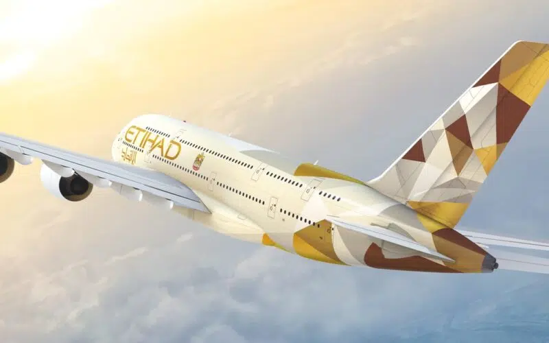
Landor Associates, a reputed brand consulting firm was tasked with the rebranding strategy. Interestingly, Landor didn’t look to aviation for inspiration but to something more earthen and sublime – the wind swept sand dunes of Abu Dhabi. The wind swept patterns on the golden desert sand cocooning the Moresque architectureBrand architecture defines the role of each brand and acts as a guideline for the interrelationship between the brands in your organization. More of Abu Dhabi served as the canvas for Landor’s design. These iconic visuals of Abu Dhabi are interpreted as copper, silver, cream and brown tessellated polygons.
The Old and New
This is a clear departure from Etihad’s old branding and the team at Landor believe such a transformation was absolutely needful for a successful rebrand strategy. The whole design concept is interestingly titled Remarkable and the chosen colours reflect the appearance of sand dunes in different lighting conditions.
In the airline, these coloured polygons exude an aura of exclusivity and premiumness while also imbibing the airline livery with a unique identity. The design team at Landor add, “Etihad is a hospitality brand that provides experiences so magical, they have to be remarked on. No detail is too small, no idea too big. The concept of Remarkable infuses the brand, creating an airline with legendary stature.”
The new livery will adorn Etihad’s fleet and the makeover operation is expected to be completed by 2017. These prismatic shapes are a safe bet in design parlance and design experts believe they have a longer “shelf life” in terms of visual appeal.
To that end, Landor have succeeded in sticking to Etihad Airways’ rebrand strategy. Speaking at the livery unveil to Jonny Clark of thedesignair.net in Hamburg, Peter Knapp, Global Creative Officer of Landor Associates, had this to say: “…we used the ambient geometry present in the architecture and culture of the emirate and reinterpreted it with a sense of Arabian modernism which has become synonymous with Etihad and Abu Dhabi itself.”
Design Theme and Interpretation
Etihad Airways’ fleet include the super-jumbo long haul A380s, long haul jumbo 787 Dreamliners and a slew of mid range 330s and 777s. The A380 consist of an industry first Residence suite, to cater to VVIP elite guests (Etihad’s term for passengers), which is essentially based around the concept of a studio apartment in an aircraft. This is followed by First, Business and Economy class, all given that remarkable Etihad touch.
The rebrand design needed to reflect these categories by having their own interpretation of the Remarkable theme infused in them.
This is what Landor have to say:
“Simply smarter economy class—Reinvents small moments that other airlines overlook, to bring a sense of surprise, spontaneity, and fun to air travel.
Intelligent business—Designed for the new global tribe that challenges traditional notions of business class.
First class—Creates a luxury travel experience so deeply personal, it’s like being transported to your own private universe.
VVIP travel—A unique vision of VIP travel with service so exclusive only a select few will fully experience it.”

The rebranded theme is reflected from the cosy and vivid prismatic pillow to the exuberant Etihad lounges across continents. The colour cues of copper, brown, cream and silver are also represented in the Residence and other classes subtly, to complete the Etihad ambience.
Trivia: An internet search reveals that Residence fliers love the polygon Etihad pillow; I cannot, but agree!

Growth Stats
Now, onto some numbers: According to travelweekly, a UK based travel website, Etihad’s annual passenger numbers grew by 23% in 2014. Given the fact that this percentage also includes Etihad’s code sharing partner airlines, it’s still a decent number, albeit 2014 being a year of slow passenger growth, globally.
Etihad’s growth trajectory continues on in 2015 as well with a 17% jump from previous year’s numbers (Times of Malta). To put in perspective, that’s about 23.3 million passengers, of which, Etihad claim 75% of that number, while the rest are taken up by their codeshare partners. This spike in growth is evidenced from 2012 onwards, leading us to believe that the rebranding strategy indeed worked, transforming Etihad as a carrier bringing Abu Dhabi to the skies.
Have you flown on one of their routes and what’s your take on the new brand livery? Let us know in the comments section below.
References: Landor Associates, The Design Air, Travel Weekly, Times of Malta
Pictures from: Landor Associates


All the article talks about is the design of some polygons. But what actually was the brief and the strategy? Why did it need to change? What customer experience insight was identified to inform the design brief? What is the positioning strategy given the other Gulf carriers? How did that lead to a design solution? What changed operationally? Has the culture of the airline been addressed in some way? What values were enhanced or changed to support a real change? Where’s the customer in all this? If these and many other questions were not part of the thinking then the correlation between the polygons and an increase in growth is tenuous… Yes, it looks nice. That isn’t enough. Branding, done properly is more than logos and palette.
Very interesting article – thank you. Love the new visual identity, it makes the brand look very professional and the planes look comfortable.
Great article and what a lovely idea to use the sand dune structure for rebranding. Creates a strong visual identity system.