


Brian’s wish, now Shatterproof, is an American national organization committed to protecting children from addiction to drugs and alcohol. Its main goal is to end the stigma and suffering of people affected by this disease.
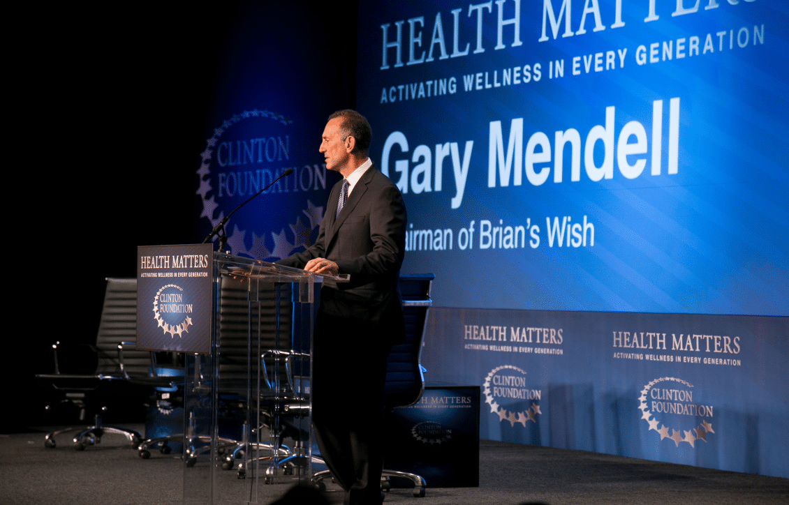
Born from a father’s grief over the loss of his 25-year old son, Brian, this national organization aims to change American attitudes about addiction. Gary Mendell, Brian’s father, believes that better prevention could have saved his son’s life.
His organization unites and empowers those who suffer from the disease, fights to end the stigma, and advocates change through evidence-based prevention, treatment and long-term recovery programs.
The rebrand strategy
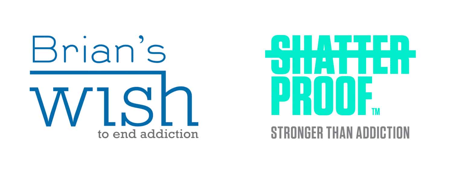
Gary Mendell hired branding firm Siegel+Gate to rebrand its organization named “Brian’s Wish”.
Proven Systems for Business Owners, Marketers, and Agencies
→ Our mini-course helps you audit and refine an existing brand in 15 days, just 15 minutes a day.
→ The Ultimate Brand Building System is your step-by-step blueprint to building and scaling powerful brands from scratch.
Table of Contents
1) The challenge:
The main challenge for this national organization was to find a new name that would be less specific or personal and have a larger scope amongst Americans.
The new name had to appeal to all generations, live long after Gary’s stewardship, remove the stigma of the word “addiction”, and reach everyone who is not aware of the risks of addiction.

2) The solution:
New name and tagline:
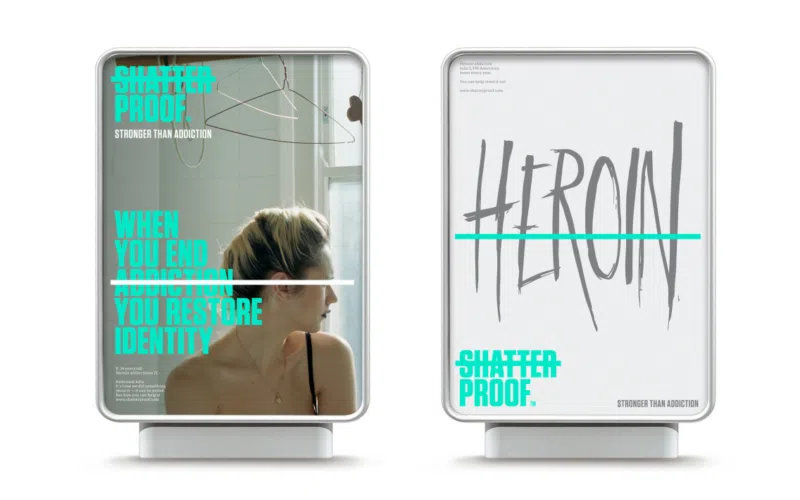
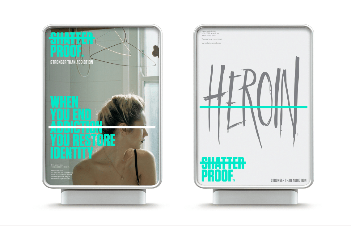
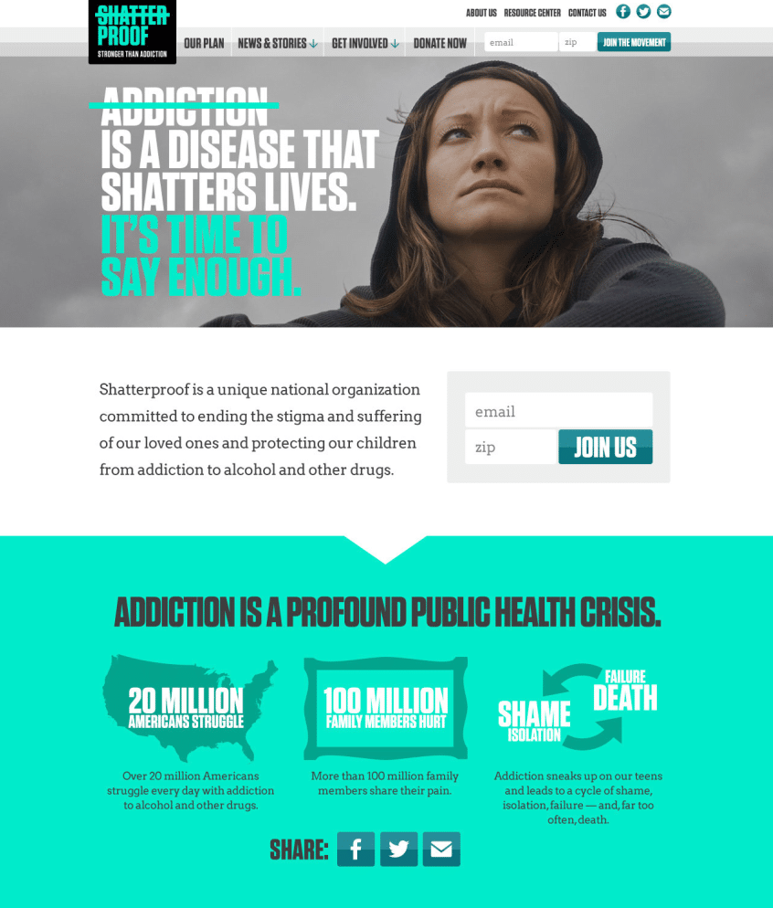
Branding firm Siegel+Gale offered to replace the name “Brian’s Wish” with “Shatterproof”, along with the new tagline “Stronger than addiction”.
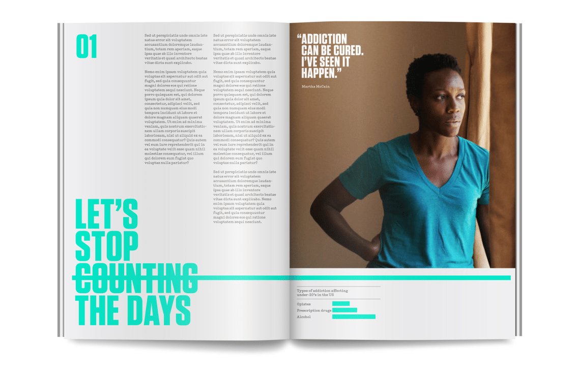
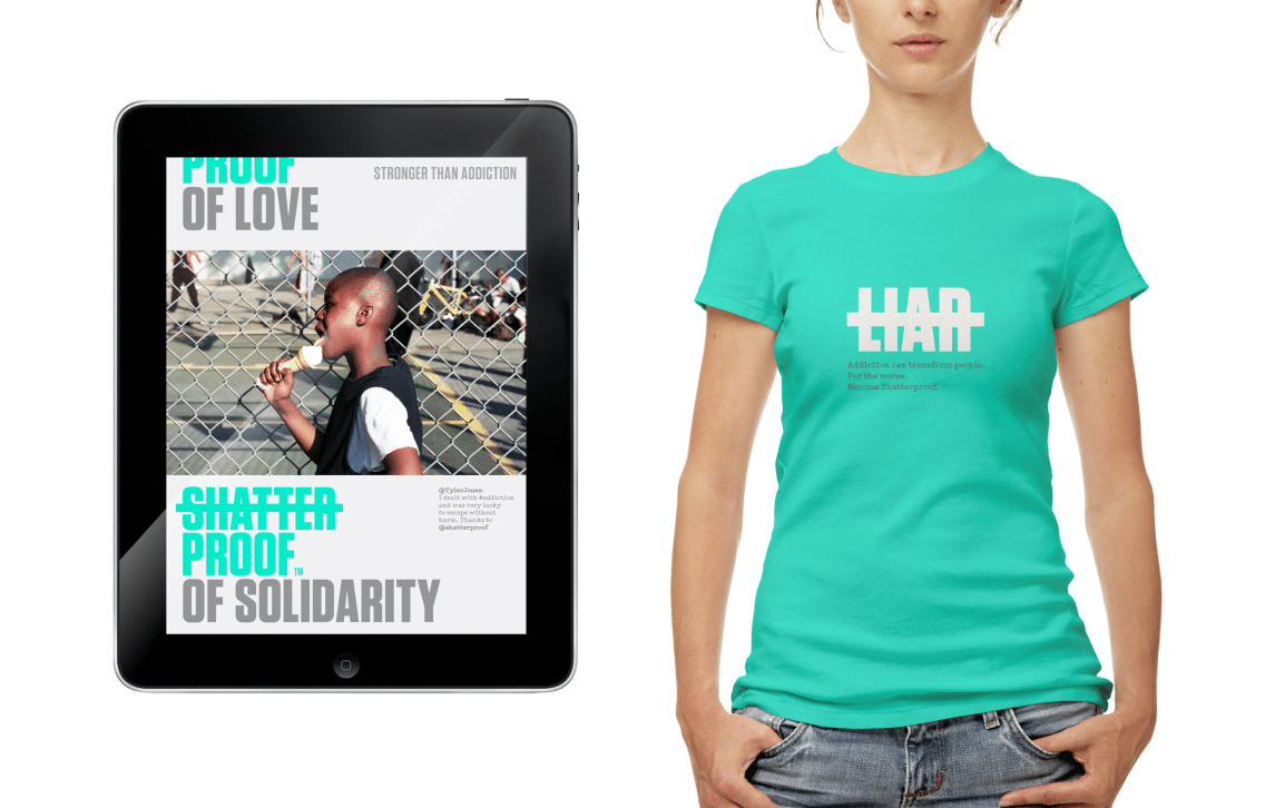
The name “Shatterproof” was chosen to reflect a positive, bold, and hopeful story.
– The last part of the name “proof” highlights the idea of resilience and strength.
– It suggests that children, families, communities and future generations become “shatterproof” thanks to this organization. Lives, families and opportunities will no longer be shattered by addiction.
The new tagline suggests that the organization is stronger than the stigmatization of “addiction”, and indeed, stronger than the addiction itself. It provides victims with a new and inspiring direction to follow; with the help of the organization they can rebuild their lives and become strong and “shatterproof”.
Visual identity:
The use of strikethrough typography on the word “shatter” suggests that the organization is already defying the idea of “shatter”.
The green color and the bold typography are meant to appeal to different generations, suggesting strength, freshness and healthiness.

3) The results:
Shatterproof launched its new identity at a San Francisco Giants game and it became a new charity partner by the New York Yankees.
Founder of the organization Gary Mendell perceives the new name and brand identity as huge steps forward for the organization. The organization is now ready to have a major role into the future by changing the way people perceive, discuss and treat addiction.
References: Rebrand, Shatterproof
Pictures from: Rebrand


