Rio will be the first South America city to host the Summer Olympics, so when it came to designing the perfect logo, to represent the games and of course the host country, they needed something special.
The major multi-sport event, known as of course the Olympic Games, are due to take place in Rio de Janeiro, Brazil, from the 5 to the 21 August 2016. This year in particular will see a record number of countries participating in the sports, with more than 10,500 athletes from 206 National Olympic Committees.
1) The Logo purpose
The logo needed to have many purposes, of course it needed to represent the games, it needed to represent the Olympics (so not straying too far from their own branding guidelines) but for Rio it needed to represent them. It was an opportunity for the country to stand up, show their culture, their flair for colour, togetherness and most importantly an opportunity to increase business and tourism.
According to the Rio 2016 Olympic Games website “The visual identity of the Rio 2016 Games is inspired by the harmonic diversity and contagious energy of Brazil’s people and Rio de Janeiro’s exuberant nature. All the elements were created based on the brands, allowing for integration and alignment.”
2) The chosen team to design the logo
The team behind the creation of the new logo is Rio-based Tatil (whose other clients include Walmart and Fiat). Tatil, of course delighted to beat the competition to win the bid for the design of the new logo, celebrated their success by creating a unique case study video talking about their process and also the hundreds of designs which were thrown out before this one was eventually chosen and amended to what it is today.
“The first step in the creative process was to open our eyes to what was around us – the people, places, images, monuments, colours, smells, sensations… this wealth of inspiration became the focal point of a photographic immersion exercise, deepening our knowledge of the city’s visual highlights. It took a little over a year, but in the end we managed to recreate the outlines of this Marvellous City”.
For many the logo is an enlightening look at the immense level of thought, preparation, depth, passion and research that went into the development of the logo.
3) Logo development
According to Tatil’s own video diary, the development of the Rio 2016 logo was critical for them. They wanted to of course make sure they got it right and it represented everything it needed to as well as the 12 inclusions it had to have. It was something they recognised had meaning across the world and it needed to work as their name was the one attached to it.
The challenge they stated was “to represent the Passion and Transformation of a city and an entire country, and project those values to the rest of the world”.
Of course also bearing in mind it was a logo which had to withstand a further 6 years into the future.
The team worked together as one, it took on the fullness of the Olympics brand which is where they saw that it must express unity, inspire achievement and optimism – of course not just for Rio but for all sportsmen and women, supporters and countries involved.
To represent Rio in a single logo can to many seem impossible and of course where to start! The research began looking at Rio’s Cariocas – its citizens. From this they soon realised the human warmth and the human nature was represented and a perfect fit with the spirit of the Olympic games and according to their blog on the logo creation it “is shaped by the exuberant nature of a city that inspires us to live passionately and carefree, and loves to share and engage with others”.
Taking this a step further the design of people joining together soon started to take shape.
4) A colour in the right direction?
The colour choices of course according to the creative team are led by the Brazilian environment – so of course nothing to do with the psychology of colour… Yellow symbolising the sun and Brazilians warm, vivacious and happy nature (or optimism, clarity and warmth). Blue, “the fluidity of the water that surrounds us, and our easy-going way of life” (or trust, dependable and strength) and finally green, to “represent the forests and hope, a positive vision that inspires us to go even further” (or peaceful, growth and health).
Looking into the psychology of colours the team have been very clever in encompassing everything Rio wants to stand for now and in the future, they’re aware of future plans and the fact the logo will remain for 6 years so hence future proofing through the use of colour representation and yes it also represents the forest and water too!
5) Shaping a logo
Of course this logo isn’t simply 3 people holding each other in different colours! To help shape the logo and really pull in the link to Rio, if you took away the words, an abstract reference to Rio’s landmark, ‘Sugarloaf Mountain’ was used, the shape of which is mapped by the logo.
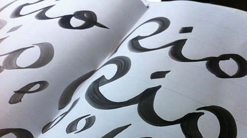
6) Typeface
You can see from the video a number of typefaces transparent on the walls, each with a different feel and fit with the logo and a bespoke brush script has eventually been chosen. The font has been crafted by Dalton Maag and from a branding perspective the team here really went into detail in this aspect because they’ve allowed the logo to be recognised as standalone due to its visual representation of Rio, now combined with the text makes this an even stronger logo.
7) Meanings
I’ve touched on the meanings behind some of the decisions that were made during the logos development process, it was about representing the spirit of Brazil and the spirit of the games. To create memorable experiences, to live a long life and celebrate an atmosphere of competitive togetherness. Bringing together people from around the world – this branding exercise has been quoted by many as being much more.
We also have to remember the money and expense the host country can go to, to make sure everything is present and correct and it is this brand that will proudly be displayed across them all – venues, products, uniforms etc.
This is much more than a logo, it is a brand which associates itself with success, progress and development. For any country and not just Brazil, when it comes to their part in the logo, it needs to represent them, tell their story, past, present and future.
At first and for many, you might just see 3 people holding hands, but it’s not until you experience Rio and understand the story behind the creation that it then makes this logo into something much more. The problem with branding on this scale is that sometimes people can see the logo without seeing the story behind its creation.
Amanda is a copywriter with over 10 years’ experience in the world of marketing and communications. With an effective and no nonsense approach, she can look at any challenge with a creative and can do attitude.